Wisdom From Ben Norland - Walker Books

This weekend I was fortunate enough to attend a seminar led by Ben Norland, art director for Walker Books, and Viviane Schwarz, illustrator and writer.

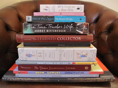
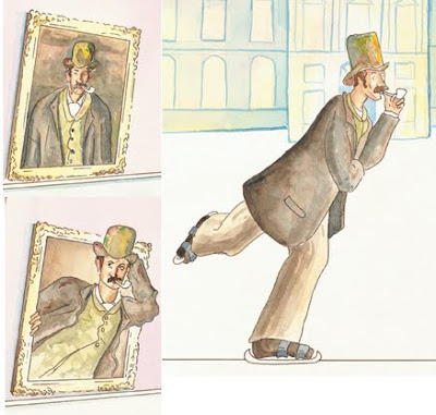
I wanted to take pictures and make sketches, but I was too busy taking notes instead. Here are some words of wisdom from the wise.

1. Sending samples/submissions to publishers is the least effective way of getting published. Most new projects are found through agents, or via word of mouth. It helps to know someone in the business.

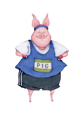
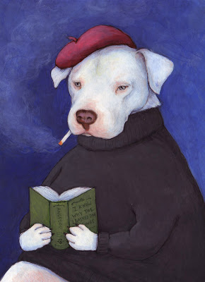
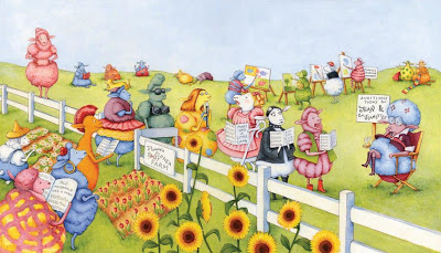
2. Portfolios: Put your best illustrations in the front, and one really good one at the end. Never include something you don't like. If you get a meeting, it's helpful to bring sketchbooks, so you can show your working methods. Also, there might be some great book ideas in your sketchbooks.

3. Agents are really helpful and useful. And, they are always one your side. The publisher isn't necessarily, as they want to make money for themselves. An agent always wants to make money for you. The more money you earn, the more money they earn.

4. Children's book publishers are desperate for more texts. Lots of artists think they can become children's book illustrators, but very few writers aspire to write picture books. If you are an illustrator who can write you double your chances of being published. Publishers are hungry for texts. Ben Norland emphasized this over and over again.

5. Your portfolio is a performance. It should take 15-20 min to look through. That means 12-20 images.

6. Editors always read a story out loud before they accept it. Apparently, at Walker Books, if they're interested in a story, they will gather a few people together and have a 'story time' where they read it out loud to see if it works as a performace. That means that you should read your story out loud to an audience before you submit it to a publisher. Always test-drive your text.

7. A story book is a performance script: the adult is the narrator, the child is the audience, and the book is the stage.

8. Three things that really matter in a children's book: consistency of characterization, context and place (the world of the book), and humour.

9. A dummy doesn't have to be perfect, but it has to show potential.

And there you have it... an entire afternoon boiled down to 9 wise words.

Why get books signed?

Why get authors and illustrators to sign books?

I contemplated this question whilst standing in a long-ish queue to get books signed by Helen Oxenbury and John Burningham.

A modern book is, by its nature, a mass produced object. The author/illustrator may put hours of work into the writing and artwork, but we consumers don't get to see that personal effort. We can't experience those hours, or touch the artwork. Instead, we hold bundles of pages that were printed and bound in a factory (probably in China).

So, we get to buy a piece of the author/illustrator's creative psyche, but there isn't a physical connection to the person. We can't see, hear or touch them: they don't perform on stages like musicians.

All we really want is an emotional connection to the creative people we admire. Getting a book signed is that connection. A moment of conversation. Eye contact. Their handwriting is physical evidence that they transformed the book from a mass-produced object into a unique work of art.

I like to take it one step further when I sign, and actually sign my books with the original pen I used to draw the illustrations. This takes the experience full circle: from my studio, to the factory, and back to my studio again (so to speak).

I'm certainly guilty of standing in long queues to get books signed. As a result I've met some fantastic authors and illustrators. Above is my London collection of signed books. You can see: Helen Oxenbury, John Burningham, Roz Streeten, Philip Pullman, Lea Stirling, John Lowden, Freya Blackwood, Sarah McIntyre, Audrey Niffenegger, Chris Ware.

There are more, oh yes, I've met so many more authors and illustrators. But, I didn't always have a book on hand for them to sign. And, there are so many more whom I'd like to meet.

Do you have any signed books?

The Egyptian Book of the Dead

Those ancient Egyptians: they knew how to wield a pen-nib with the utmost accuracy and simplicity. I am amazed how the scribes could express so much emotion with one stroke. You would think they were modern graphic designers schooled in the art of vector linework. But, no... they lived and worked 3000 years ago on papyrus and linen (not even paper was available!). Truly, truly extraordinary.

If you're lucky enough to be in London this winter, don't miss the

Egyptian Book of the Dead

at the British Museum.

Determination

... and how does a chair relate to determination?

This is how a book or story has to start.

Something rings in my head, like Great Tom. A knell...

Then I must invoke the magic word.

Oh, yes -- there is one.

All truly successful writers know it.

I shall whisper it in your ear:

BIC.

It stands for

Butt In Chair.

Really. Hard work is the only real magic there is...if the book in your head is to get onto the page.

Jane Yolen

"Take Joy" (p. 84)

Oh, and what a chair it is! The most creative, writery chair of my acquaintance. Something Hemingway would happily sit in whilst smoking and drinking gin.

The various chairs around our house have aided me in editing (re-writing) 3830 words of my 45000 word story. Three days of work: one thousand words per day (minimum). They say Stephen King writes 2000 words per day, but he's special, I'm sure. Or, he has some amazing chairs.

Hopefully my chairs will continue to cooperate in the next month, as I pull and push my characters around a dusty town in North Africa.

Athens for Archaeology Lovers and Santorini

They say a picture is worth a thousand words. I was stunned by Athens.  I love history, archaeology, and all things ancient. Then we spent a week relaxing on the island of Santorini.  I'm lost for words, it was heaven.  Just take a look.  

Santorini....

20 Questions with... Lauren Castillo

Image © Lauren Castillo

This morning I woke to a wonderful surprise in my inbox: an interview from Lauren Castillo. A few months ago, I asked Lauren Castillo to do a 20 questions interview for my blog; she said that she'd love to, but she was quite busy and might have time come October. I pencilled her name into my October calendar and forgot about it as I concentrated on other things. They say wonderful things come to you when you're not waiting for them; and this is the perfect example! :-)

I have always admired Lauren's work. I first heard her name when I was stalking the web pages of the School of Visual Arts in New York.

(This was my dream school, where I wanted to do a masters of illustration IF... if i could afford it.... if I had gotten in.... if I and hadn't fallen in love with someone in the UK....)

And, since then I have enjoyed reading her blog and keeping up with her children's books.

And, without further procrastination, here is her interview!

1. What was your first illustrating job?

I did a small emergent reader book back in 2004. But my first actual project as a children's book illustrator was offered to me in 2005, titled WHAT HAPPENS ON WEDNESDAYS, by Emily Jenkins. Frances Foster over at Farrar, Straus and Giroux (Macmillan) was the awesome editor who took a chance on an "unknown artist", and I am so grateful to still be working with her today.

2. How long have you been an illustrator?

I've been illustrating full-time for about 5 years now.

3. Which success, either personal or professional, are you most proud of?

I think I'm most proud of myself for being able to survive here in EXPENSIVE New York City as an illustrator. I came to the city for graduate school, but honestly didn't think I'd still be living here so long afterward. I won't lie, NYC livin' as an artist is rough! But I am working super hard to be able to continue to afford it--I love this city too much to say goodbye!

Image © Lauren Castillo

4. Do you have any comfort routines to cope with rejections?

I suppose I just work though it. It's no secret that the publishing industry is a competitive one, and I am always prepared for projects/story ideas that I pitch to be turned down. While it can be hard to receive negative feedback, I like to look at it as advice to help me improve my storytelling skills. I figure that no matter how many years I am in the business, or how many books I will have published, there is always going to be room for improvement.

5. Which illustrators or artists do you admire the most? Why?

Some of my very favorite children's book illustrators are Ezra Jack Keats, Maurice Sendak and John Burningham. All three of these guys know how to create characters filled with personality and emotion, and incredible, magical worlds for those characters to live in.

6. What was your favourite book as a child? Does that book influence you now?

There were so many! But the first book I can remember buying on my own (at a school book fair) was David Small's IMOGENE'S ANTLERS. I found it while going through a box at my parents' house a few years ago, and realized for the first time that one of my current favorite illustrator's was the creator of the book I wore out as a child. I was so excited to make that connection!

7. What are the essential items to take with you when you go out? (sketchbook, journal, camera?)

When I'm traveling somewhere new, I always bring along a small size sketchbook. Location drawing is my favorite kind of drawing!

Image © Lauren Castillo

8. What is your favourite medium for illustration? When did you first start using it?

I love the textured line that results from acetone transfers, which I've used to create almost all of my picture books (I first experimented with this technique in 2004). But I've recently been trying to find a less toxic method, that has a similar result. Any suggestions???

9. How good is your handwriting? Do you use your own handwriting in your illustrations?

I like my handwriting, but I know it is not always legible to others. I have had the opportunity to collaborate with a couple designers though, drawing the cover type for a few of my books. That was great fun!

10. What do you collect? Why?

I have a thing for fun patterned papers and fabrics, and save scraps for possible collage, or pattern ideas to use in some parts of my illustrations. For example: In the illustration below I used a pattern from an old piece of fabric for the wallpaper. This image is a spread from my book

BIG CAT PEPPER

.

Image © Lauren Castillo

11. Do you have a ‘style’ or do you vary your methods for each project?

It hasn't really been intentional, but all of my books, regardless of subject matter, end up looking like "me".

12. Do you scribble in the margins of books? Or make notes or underline things that inspire you?

Not so much now. But when I was in school I'd doodle in everything--It somehow helped me to pay better attention to the teacher and lesson :)

13. Do you have a morning routine in the studio to prime your inspiration?

I enjoy browsing through some of my favorite blogs over coffee, before I get to work.

14. When do you work best, in the morning, afternoon or evening?

This always changes. But recently my best work time is before lunch, and then in the early evening hours. I find that I'm not my most productive in the mid-afternoon. Maybe it's this summer heat!

15. What is the one art supply you could not live without?

I love my Pilot Razor Point Pen. I can draw AND watercolor with it.

Image © Lauren Castillo

16. Do you have a favourite café? Do you sketch or write in cafés?

I used to go to a place called Cup Of Joe's (here's an acetone transfer drawing I did of the café), but it closed last year. There's a really nice park a few blocks away that I sometimes take my sketchbook to.

17. When you look out the window in your studio, what do you see?

(see photo)

Image © Lauren Castillo

Image © Lauren Castillo

18. How do you like your coffee, or tea?

Coffee please! With cream and a little sugar.

19. What’s on your nightstand right now?

A Y.A. novel by Monika Schröder titled SARASWATI'S WAY

.20. Any words of advice for other illustrators in the field?

Create the kind of art and stories that interest YOU. Don't try to create what you think will please others (the market). In the end, your most honest work will be your best work.

Image © Lauren Castillo

Check out Lauren's work:

Website:

http://www.laurencastillo.com/

Shop:

http://www.etsy.com/shop/laurencastillo

Amazon:

Lauren Castillo on Amazon

My alternate CV: reinventing the resume

Above is another painting from my archives. Several years ago I flew to Victoria BC to visit my friend who was working as a nanny (for twins). I had a great time discovering our western-most provincial capital with her. And, to commemorate the lovely holiday I gave her a small watercolour of one of the famous BC totem poles.

I spent much of yesterday afternoon with this same friend and we decided that we needed to write alternate CVs. She is an aspiring opera/oratorio singer and I am an aspiring illustrator/ writer. When we write a serious CV, we list all the experiences, skills and accomplishments we feel will benefit our future employers. But what about all those random skills we have acquired over the years that get overlooked? Shouldn't we be proud of them, too?

Here is a random selection of some of my "not-so-useful-in-the-real-world" accomplishments:

1. Took Babysitting course when 13, did very little babysitting thereafter

2. Welding

3. Drive bobcat

4. Drive fork-lift

5. Can read Latin

6. High School Physics, Chemistry, and Math tutor

7. Photocopying

8. Can clean large farm vehicles with a pressure washer

9. Canoeing - especially steering and the J-stroke

10. Can squaredance

11. Mending clothes

12. Orienteering (with compass, or without, can usually tell North by reading the environment)

13. Bake a cake on a coleman camping stove

14. Origami

15. Fastest library book shelver in the Steinbach library

What are your 'not-so-useful-in-the-real-world' accomplishments?

Sketching in Berlin

It is already over a week since I returned from Berlin, but at last, I have sorted my photos. Despite my best efforts at artistic photography, none of the photos were really that inspiring. I had more fun sketching in my Skizzenbuch than photographing. Here you can see me enjoying a glass of wine near Sevigny Platz and drawing the little boutique-lined street.

I try to draw everywhere I go, though sometimes I am more conscientious than others.

Add caption

20 Questions with... Nicola Streeten

Image © Nicola Streeten

I met Nicola Streeten a year ago at the first Laydeez do Comicsmeeting at theRag Factoryin Brick Lane (London). She and her friend, Sarah Lightman, started up a fantastic reading group of laydeez (and laddies) who love autobiographical and literary graphic novels and comics (no superheros, please). We meet once a month for spicy discussion which then segues to spicy curries on Brick Lane.

Nicola is also an accomplished illustrator, and has done work for greeting card companies, magazines, publishers and corporate clients. At the moment she is working on a graphic novel.

1. What was your first illustrating job?

It was slightly by default. My little son died in 1995 and I started drawing, just sketching to ease my mind. I’d done a card for a friend’s new baby, A-Z of Babies, that I showed to a close friend who ran a small greeting card publishing company. She thought it would work as the first in a series of greeting cards and commissioned me to do six. (I think she published them to cheer me up, because her business partner hated them.) It turned into a range of 80 titles, the best line their company had ever produced, had a life of about ten years and started my career as an illustrator.

2. How long have you been an illustrator?

Since 1996 after my first illustration job, I sent samples around magazines to pick up editorial work and within a year I’d given up my ‘day job’ (which I hated) and was able to just illustrate.

3. Which success, either personal or professional, are you most proud of?

I have always believed that if you do what you feel passionate about it will lead on to opportunities and that you will carve a living of some kind out of it.

4. Do you have any comfort routines to cope with rejections?

I have a great husband and daughter, John and Sally. There’s no better salve than spending time with them.

PLUS

My brother in law, a salesman told me that in sales you need to earn 250 ‘nos’ for every ‘yes’. So every no is getting you nearer the next yes.

5. Which illustrators or artists do you admire the most? Why?

I really like artists like Louise Bourgeois and Sophie Calle for the ideas behind and in their work.

I like Paula Scher’s work for the illustrated typographical approach. I like Tom Gauld and Simone Lia also for the social mores they play with.

6. What was your favourite book as a child? Does that book influence you now?

Eloise by Kay Thompson. I saw it maybe once at a friend’s house loved it. When I came across it as an adult I found it the perfect children’s book, even though it was created originally for adults. I also loved Dr Seuss books and still do. Those books don’t really influence me now, but were a strong influence when I first started illustrating, because the focus was on the content rather than the style.

Image © Nicola Streeten - A to Z of birth

7. What are the essential items to take with you when you go out? (sketchbook, journal, camera?)

I only carry a little note book with me when I visit the big art shows, like Venice Biennale or Documenta, so I can note down works I like.

8. What is your favourite medium for illustration? When did you first start using it?Rotring pen .25 and watercolour on photo copy paper or thin cartridge paper. I use a lightbox. I don’t like the idea of preciousness about materials I think it inhibits my style. I do like playing with photoshop, but have always drawn the line and scanned it in.

9. How good is your handwriting? Do you use your own handwriting in your illustrations?

My handwriting is good and has always been a part of my illustrations. I really really like the interaction of text and image. Most of my illustration work has included handwritten text.

10. What do you collect? Why?

John, Sally and I have a display cabinet we found in an old railway room which John fixed up. In it are lots of things we have that we don’t know what to do with, but don’t want to throw away. For example, I have two plaits of my hair from times it was long, a Biba carrier bag, a book of green shield stamps, the pregnancy test when I found I was pregnant. Stuff that carries stories and memories. I was inspired to do this after visiting the Pitt Rivers Museum where there’s a load of junk all beautifully hand labeled and under glass. I started doing little labels for our stuff…but haven’t finished!

11. Do you have a ‘style’ or do you vary your methods for each project?

I have a definite style. It changes a bit with photoshop colour, but I think it is recognisable.

12. Do you scribble in the margins of books?

Occasionally.

13. Do you have a morning routine in the studio to prime your inspiration?

The internet, radio 4

14. When do you work best, in the morning, afternoon or evening?

Morning.

Image © Nicola Streeten - Excerpt from "Billy, me and you"

15. What is the one art supply you could not live without?

Roting Pen

16. Do you have a favourite café or restaurant in London?

No

17. When you look out the window in your studio, what do you see?

Sky, trees and the tops of apple trees.

18. How do you like your coffee, or tea?

Coffee v strong black. Tea pg with milk no sugar.

19. What’s on your nightstand right now?

A digital clock

20. Any words of advice for other illustrators in the field?

You need 98% talent + 2% determination OR 2% talent + 98% determination

Image © Nicola Streeten - Nicola's Studio before clean-up

Nicola's Blog and website: http://www.streetenillustration.com/

Laydeez do comics:

Image © Nicola Streeten - Nicola's Studio after clean-up

John Shelley: 20 Questions

Image © John Shelley

I first met John Shelley in Bologna (2010) when he was manning the SCBWI stand. I popped by to have a chat about joining the society, and we found out that we share the same post code in London (and the same local coffee shop). He has worked as in illustrator in Japan for 20 years and has recently relocated to London.

I admire the delicate perfection of his illustrations, which perfectly evoke the golden age of children's book illustration. Read on and find out more about him in the interview...

1. What’s on your nightstand right now?

A lamp, an alarm clock, a copy of Margaret Wise Brown: Awakened by the Moon by Leonard Marcus.

2. What was your first illustrating job?

First professional commission was to illustrate the book Fat bag by Jeremy Strong, published by A & C Black, a few months after graduating. I drew a coloured jacket and around 30-40 interior black and white drawings. The Puffin paperback edition (with different cover) is still in print, a little to my embarassment!

3. How long have you been an illustrator?

29 years.

4. Which success, either personal or professional, are you most proud of?

Professionally I’m quite proud that I carved a successful illustration career for myself in Japan after arriving with just a suitcase, a portfolio and a phrase book, and became established there for over 20 years.

On a personal level I’m just grateful that I’m surviving, and still smiling.

5. Do you have any comfort routines to cope with rejections?

I think it’s essential to develop a thick skin against rejection. I try to expect nothing but hope for the best, so am always very pleasantly surprised when things do go right. When things take a downturn go for a long walk, refresh your mind doing something utterly different, then hang out in a bookshop or gallery, get inspired, breathe deeply and carry on. Once more unto the breach!

6. Which illustrators or artists do you admire the most? Why?

I admire many, “favourites” are always changing, and if asked to name names find it almost impossible to make a short list, especially in this internet-age. Often nowadays I jump on images rather than artists - such and such a picture or book rather than the artist’s entire output. If you ask me who has been most influential on me (subtly different to favourite) I’d say the Golden Age illustrators (Rackham, Dulac, Heath-Robinson etc), Rowlandson, Herge, Quentin Blake, Edward Ardizzone, Japanese Ukiyo-e artists, Indian/Persian miniatures etc. These indicate where I’ve come from, though it doesn’t mean I’m not equally inspired by newer artists or fresh things around me. They indicate where I started from creatively, but not necessarily where I’m at now, or where I’m going.

7. What was your favourite book as a child? Does that book influence you now?

I didn’t have many books as a child, I remember being fond of Beatrix Potter and Rupert though. One definite favourite was one of my mother’s books from her 1930’s childhood which was usually shut away out of reach, a volume of collected fairytales including illustrations by the Robinsons, Rackham etc.

Image © John Shelley

8. What are the essential items to take with you when you go out? (sketchbook, journal, camera?)

I always carry a small pocket sketchbook, a notebook for story ideas and a pen. I feel naked without a sketchbook.

9. What is your favourite medium for illustration? When did you first start using it?

Pen & Ink (with or without watercolour). I used to draw incessantly with ball point pens from at least the age of 12. When I was around 14 a school art teacher saw some of these drawings and recommended I try pen & ink. The first thing I attempted with a dip-pen was to copy a Victorian engraving of The Last Voyage of Henry Hudson (after the painting by John Collier). A tough challenge! But I never looked back thereafter.

Here’s the original, no idea what happened to my adolescent version:

10. How good is your handwriting? Do you use your own handwriting in your illustrations?

Well I’m legible I believe! I occasionally use my handwriting in children’s illustrations when the situation allows. I’m often asked to create chunky hand-drawn lettering in commercial illustration in Japan.

11. What do you collect? Why?

I used to collect many things, but have considerably trimmed down since leaving Japan, I jettisoned a vast amount of things when I left, some of which I later regretted, like my entire record collection (sob).

The few things I’ve held onto are very dear to me. I’ve a good collection of 1st Edition Golden Age (1890’s-1920’s) books, mostly Arthur Rackham with a few others, though I haven’t added titles for a few years. I love them not only because of the artwork, it’s the books themselves, the feeling of pressed type on the page, the tipped-in plates, the care of production, the layout.

12. Do you have a ‘style’ or do you vary your methods for each project?

It’s important to limit your range of styles and not be too scattered in interpretation, though I tend to be quite broad. I adjust style somewhat to match the text of books or the project, but I try to keep an overall continuity within my work. I try to develop my interpretation of the text based on the mood created by the work. Mervyn Peake once said “books have different smells... It is for the illustrator to make his drawings have the same smell as the book he is illustrating” . I find that a good policy, as long as you don’t lose track of your overall creative vision. Adhere to your style, but remember that “(the illustrator) must have the chameleon's power to take on the colour of the leaf he dwells on”.

13. Do you scribble in the margins of books?

Absolutely not! books are sacred.

14. Do you have a morning routine in the studio to prime your inspiration?

No, I should though.

15. When do you work best, in the morning, afternoon or evening?

I used to be a total night-owl, nowadays I tend to get into my stride late afternoon, unfortunate as I have to down tools and look after daughter then. I can be very focused first thing in the morning if I’m not distracted, but life being what it is....

16. What is the one art supply you could not live without?

Black ink.

17. Do you have a favourite café or restaurant in London?

I’m looking around, I like the new café in Queen’s Park though. 

Image © John Shelley

18. When you look out the window in your studio, what do you see?

My home is studio at the moment and I work in two rooms. Front room overlooks grassy Queen’s Park. My workroom (where I actually paint) is not quite so inspiring - yard and fence dividing next door’s garden.

19. How do you like your coffee, or tea?

Coffee - strongish, always filter, never instant.

Tea - milk, no sugar.

20. Any words of advice for other illustrators in the field?

Keep drawing, keep sketching, exploring ideas. Keep pushing and explore ways to reinvent what you do. Follow avenues of inspiration. Stand back, look at the market and see how your work fits in, make your work is sellable, but don’t sell out.

Don’t be put off by moaning minnies about the economy poor market for illustration, if you’re good and have a vision, the market will be there.

Image © John Shelley

For more information about John Shelley you can visit these links:

Website:

http://www.shelleyillustration.com/

Blog:

http://johnshelley.blogspot.com/

Flickr:

http://www.flickr.com/photos/penpusher/

Victoria Jamieson: 20 Questions

Image © Victoria Jamieson

I first "met" Victoria Jamieson  almost a year ago when I googled "illustration blog" and hers was the first in the search list. Since then I have been an avid reader: she has a series of posts called Illustration Correspondence Course which are must reads for anyone wanting to get into children's books, or just looking to refresh their inspiration.

She draws animals with attitude. Her most recent book is called Bea Rocks the Flock, published with Bloomsbury. And, her upcoming book is called "Olympig" and is to be published with Dial in 2012. Victoria says, "It's about a pig with gold-medal dreams but a benchwarmer's talent." [See image below.]

So, without further procrastination... here is Victoria's interview!

1. What was your first illustrating job?

I guess my first "real" illustrating job was the interior illustrations for The Gollywhopper Games, by Jody Feldman. I was working in the design department of Greenwillow Books at the time (the book's publisher), and they needed someone quick, local & cheap, and I fit the bill.

Even before that, however, I'd always try to sneak my illustrations into my freelance graphic design projects. I think a big part of getting illustration jobs is being willing to put yourself out there- which can be awkward and embarrassing sometimes! I've built up a pretty tough skin and a high tolerance for embarrassment over the years.

2. How long have you been an illustrator?

I'd say I got really serious about illustration several years after graduating from art school- so maybe 7 or 8 years ago. Like many illustrators, however, I'm still an "illustrator and..."- meaning I still have to work part-time at other jobs to make ends meet.

3. Which success, either personal or professional, are you most proud of?

I'm quite proud of recently joining a roller derby league! For me, thesuccess was in overcoming something that terrified me and living to tell the tale. I actually really enjoy throwing myself into somewhat crazy situations and seeing how I survive. I remember standing outside the practice rink on the first day of roller derby, thinking, "I have no idea what is going to happen to me for the next two hours", and getting that scared-yet-excited twinge deep in the pit of my stomach. If you get yourself used to the feeling of withstanding crazy situations, then nothing- not speaking in front of 500 schoolkids, or asking your boss for a raise, or introducing yourself to an editor at a cocktail party- seems all that scary.

4. Do you have any comfort routines to cope with rejections?

See above! Nothing like smacking into some ladies on skates to get the aggression out! Even before derby, however, I liked to work things out physically, like taking a nice long run. I think I have two parts of me that deal with rejections in different ways. I got a mild-to-poor review once, and the front part of my brain, near my forehead (yes, I can feel it), responded "WHAT-EVER!! What do you know anyway, lady?! Let's see you write a book, flibbity jibitty &*#($ (that's the part not appropriate for a children's book blog).

But another part of me, deep in the pit of my stomach (next to the derby butterflies) admitted, in a small voice, that some of her criticisms were TRUE. I listen to this small voice because it reminds me of things I can improve upon in the future. I think it's good to be slightly bipolar in this way: learn from your rejections, but never, EVER let a critic stop you from doing what you love.

Olympig - Image © Victoria Jamieson

5. Which illustrators or artists do you admire the most? Why?

Oh, goodness. Mo Willems' books are genius, pure and simple. I never get tired of that pigeon. I also have a copy of Peter Brown's The Curious Garden next to my drawing table. That book is so beautiful it makes me almost physically sick (that's a compliment). It has such a subdued, beautiful color palette. I also love No, David! by David Shannon- another deceptively simple tale, but that always gives me goosebumps by the end. And Beverly Cleary depicts childhood with such stunning honesty. And, and, and...!

6. What was your favourite book as a child? Does that book influence you now?

I love going back and re-reading my childhood favorites! I'm always surprised how such short, simple books with very few words could make themselves so large in my mind. I loved a book called Molly's Moe by Kay Chorao. I haven't gone back to re-read that one, but I remember thinking the black and white illustrations were so beautiful. Even though we went to the Philadelphia Museum of Art practically every Sunday, picture books really were my introduction to fine arts, because I could hold them in my hands. And they depicted things I cared about, like kids, and not historical scenes or blocks of color.

7. What are the essential items to take with you when you go out? (sketchbook, journal, camera?)

I like the thought of having a dedicated sketchbook, but really, that's too structured for my style of sketching. I sketch A LOT, and on EVERYTHING. A sketchbook makes it seem so formal, like the sketches have to be good. I like to have an army of pencils when I go out and a stack of scrap paper to scribble on. I am also a stinker when it comes to my camera, and always forget to take pictures.

8. What is your favourite medium for illustration? When did you first start using it?

I like acrylics, and am trying to create more of a drawing/painting hybrid. It's a work in progress. I was introduced to acrylics in art school. I pooh-poohed them originally, because I was a Serious Oil Painter - but truthfully I was Not A Very Good Oil Painter because my Colors Always Got Muddy - and I learned to love the quick-drying nature of acrylics.

Image © Victoria Jamieson

9. How good is your handwriting? Do you use your own handwriting in your illustrations?

I like my handwriting alright! I've always liked the process of physically writing things down. The thing I liked best about math homework was physically making the marks on the paper- weird, right?

No, I don't usually use handwriting on illustrations. I've learned from working in publishing to separate text from the art. That way, text edits or foreign editions are much easier.

10. What do you collect? Why?

Children's books! Because I have a one-track mind! And I can justify them by telling myself they're tax write-offs and that I really need them for the classes I teach.

11. Do you have a ‘style’ or do you vary your methods for each project?

I'd say I have a style. For shorter projects (for my graphic design clients), I'll often create illustrations digitally- I'll scan my pencil drawings and add color in Photoshop. But for my books, the finals are all done traditionally.

12. Do you scribble in the margins of books?

I would not treat my books so! Although I may have been guilty in high school with my textbooks. No, I scribble in everything BUT books!

Bea Rocks the Flock - Image © Victoria Jamieson

13. Do you have a morning routine in the studio to prime your inspiration?

If I'm in the middle of a project that I really love, I honestly don't need much priming- it's harder for me to put myself to bed at night. Now, if you have some recommendations for getting in the mindset for projects I DON'T want to do, I would love to hear them!

14. When do you work best, in the morning, afternoon or evening?

I wrote and illustrated my first book while I had a full-time job, so I learned to utilize every possible moment available to me. I think I still work best at night- that way, you don't have the pesky sun reminding you of how much time is passing! And I do tend to get sleepy in the mid-afternoon.

15. What is the one art supply you could not live without?

Hmm, I guess my acrylic paints! I have a nice rainbow of Prismacolors that I'm pretty fond of, too.

16. Do you have a favourite café or restaurant in London?

Oooh, la la, fancy! I guess if you LIVE in London it doesn't seem that fancy! :) I did go to London for 5 days when I was a student in Rome. I can't remember any specific cafes, but I do remember loving the way a waiter pronounced "Mooooooshy peas". I had to order them after that! For months afterwards my traveling companion & I would crack each other up by asking, "And how did you like your moooooooooshy peas?"

[Author's note: I should have asked for your favourite café anywhere, not just in London. :-) ]

Victoria's Studio - Image © Victoria Jamieson

17. When you look out the window in your studio, what do you see?

Trees! And my neighbor's manicured lawn. Once I saw a runaway bunny hopping down the street- that was an exciting day. The owner came chasing after it- it was madness!

18. How do you like your coffee, or tea?

Coffee!! I've tried to like tea, but much like pickles, I can't make myself love it. My husband & I moved to Portland, Oregon largely because of the excellent coffee here. I like it light and sweet, and I always gauge the beginning of summer by my first iced coffee. Yum!

19. What’s on your nightstand right now?

Unfortunately, I thought it would look really nice to gather some dead sticks from outside & display them artistically on my nightstand. I think I saw it in a Martha Stewart magazine. I didn't have any artistic vases, however, so they're in an old yogurt container that tips over really easily. It's time to get rid of them.

20. Any words of advice for other illustrators?

I think it helps to be a slightly delusional optimist. It's hard work, you have no social life, and face nearly constant rejection. And yet, maybe that next postcard you send out...

Victoria's collection of books and art supplies - Image © Victoria Jamieson

To see more of Victoria's work you can go to:

Her blog:

http://www.victoriajamieson-illustration.blogspot.com/

Her website:

http://victoriajamieson.com/

Bea Rocks the Flock:

http://www.indiebound.org/

book/9781599902609

Italian Drawings - British Museum

Yesterday morning I went to the British Museum to see their current exhibition of Italian Renaissance Drawings. Walking around the darkened rotunda of the 'reading room' looking at the delicate coal and sepia sketches by the Italian masters (Fra Angelico, Leonardo, Michelangelo, Raphael) filled me with renewed inspiration and vigor for my field.

The one quote that stuck in my head and won't leave is by Leonardo da Vinci. He said:

"The sketching out of the narrative should be rapid and the arrangement of the limbs not too defined."

I think that I sometimes focus too much on getting it 'right' the first time. A little rapid scribbling might do me good.

In the above sketch you see St. Peter in his funny hat, and two gallery attendees examining him on the wall, one is listening to one of those media player thingies.

If you're in London and you love drawing, you should definitely make an effort to go the the British Museum.

Magic at the Museum: Degas Dancers

The next two Magic at the Museum characters I am going to introduce you to are the ballet dancers. They come from a painting by Edgar Degas called "Two Dancers on the Stage". Degas painted it in Paris in 1874. The painting shows dancers rehearsing or performing on the stage. The viewers attention is focused on the poses of the dancers, as they are seen from an unexpected angle. If you look closely, there is also a third dancer in the upper left corner (you can just see her blue skirt) approaching the stage. Is is leaving the dance or joining?

I had fun with these characters. Since Magic at the Museum is all about skating and dancing, I had to re-learn a lot of the ballet I had learned as a child to get their graceful movements. I tried to always draw their compositions as if someone had choreographed their movements. They always had to look graceful and composed.


Magic at the Museum: The Madonna

The next character from Magic at the Museum that I want to introduce you to is the Madonna. She comes from a painting of the Virgin and Child by Parmigianino, painted between 1524 and 1527. He painted it when he was staying in Rome, and the classical building in the background might be a references to the ruins of ancient Rome.

This painting is unfinished,and is quite sketchy, especially in the bottom right corner, where you can see his sepia sketches. The brown sections of the Madonna's skirt are unfinished; Parmiginanino intended them to be blue. I left them brown on my character to stay true to the painting as it is, not as it was intended.

He wanted this painting to be perfect. This perfectionism led him to procrastinate to such a degree that he never finished the painting and was imprisoned for breach of contract.

The Madonna in this painting has incredibly long legs, arms and neck. If she were real, she would probably be over 6 feet tall (rather like the exaggerated proportions of Alexandre who was painted 3 centuries later). This is due to the Renaissance Mannerist  movement. Mannerist paintings are known for elongated forms, precariously balanced poses, a collapsed perspective, irrational settings, and theatrical lighting. It was a challenge to maintain those distortions when drawing the Madonna, for I always wanted to "correct" them!

The Madonna and Alexandre make a pair. They both have exaggerated proportions that make them unnaturally tall.

How to put together an amazing illustration portfolio

As an illustrator, you portfolio is the most important thing in your arsenal of tools. It showcases your talents to the world and gives potential clients an insight into your working style. Your portfolio must show your pride in your work. It must present your work as luxurious and beautiful, something for art directors to covet. Show your artwork the respect it deserves and other people will be impressed as well.

1. Buy a beautiful portfolio case or binder. My personal favourites are Pratt and Panodia. They are smart, professional, and durable. Your portfolio will land in a pile of other portfolios on an art director's desk, you want it to have presence and weight. To stand out from the others because it is beautifully and professionally presented.

2. Personalize the cover in some way. Many of my friends glued on cards with their name and address. I didn't feel comfortable denaturing the front of my beautiful portfolio. Instead I took a piece of ribbon and tied my business card to the front loop. This way it makes the portfolio look like a gift for the art director.

3. Sleeves: Make sure your plastic sleeves are as transparent and fingerprint free as possible. You want to your artwork to shine.

4. Paper: Don't tape or glue photocopies of your artwork onto the grey or black backing pages of the portfolio. Print your images onto sumptuous heavy rag paper, such as Somerset Velvet, which is lightly textured paper for inkjet printers. The art paper makes the digital print look almost as good as the original, the colours sit on top of the sizing of the paper, rather than soaking in like regular paper. This makes them extra brilliant.

5. Title Page: The title page is the first thing an art director will see. Make sure you have a strong image on that page, as well as your contact details. This will make them curious to find out what is in the rest of the book.

6. Page and Book Design: Make sure your spreads are well designed. Think about the portfolio as a book, not just a collection of images. Start with your strongest images at the front, then include with a few projects you are proud of, then then end with a few strong images again. You have to think of the structure like a sonnet or an essay with an introduction, a body and a conclusion.

7. Number of Images: Most mail-in submissions ask for 8-10 images. However, you can indulge when you get the chance to show your physical portfolio. I suggest having 20-40 images. This is your chance to shine; show your diversity.

8. Can I have more than one image on one page? Yes. But make sure they are paired well so the compliment rather than compete with each other. Make sure you keep a good rhythm: some pages with only one image, some pages with more. This keeps your book interesting.

9. Include some postcards: I always submit my portfolio with a few postcards that the art directors can keep. This helps me to gauge their reaction. If they keep the postcards I know that they were interested.

Magic at the Museum: Alexandre

Continuing with my series of characters from Magic at the Museum, I want to introduce you to Alexandre. "Man with a pipe" was painted by Paul Cézanne, and now hangs in the Courtauld Art Gallery. Alexandre was a peasant gardener. I think Cézanne used lots of browns, ochres, yellows and greens to paint him because he worked with in nature and with the earth.

Cézanne focused on the relationships of colour and tone, rather than literal representation of the subject. I tried to emulate that by laying the water colour pigment quite thickly on the paper.

If you look closely, you will see that his head is very small compared to his body (or, perhaps he is just very tall). I used this feature to advantage in the action scenes; Alexandre always looks very strong and powerful. In response to the sometimes odd perspective in his paintings, Cézanne told his critics, "I have a lazy eye." :-) Alexandre's elongated body perfectly compliments the strange anatomy of the Italian Madonna, whom you will hear about next.

The skating pose you see above is a funny quote of a Scottish painting called The Reverend Robert Walker Skating on Duddingston Loch. It was painted by Sir Henry Raeburn in 1790. I think it is really fun to add small art historical inside jokes into children's picture books. Although the children and parents might not understand when they read the book, it will add an element of depth that otherwise wouldn't be there.

Creating and Designing a Family Cookbook and Genealogy


Often the things we remember most about our families is the food we eat when we are together. Every family has treasured recipes that are beloved as much for the memories they evoke as how they taste. Those recipes tell a sensual history of a family: of generations passing down good food, good experiences, joy, sympathy, love. Many emotions can be intimately tied to food and its preparation.

Turning those family favourites and heirloom recipes into a cookbook is an original and inspired way of telling your family's history. The story slides imperceptibly from family recipes, memories, and photographs to family history and genealogy. It is a more human way of connecting one's life to one's history. Sometimes looking at family tree charts and time-lines can seem quite abstract and clinical. Combining them with recipes and stories makes the history more immediate and accessible.

Steps to Create A Cookbook:

1. Collect the Recipes: Send an email or make a phone call to your relatives asking for their favourite recipes. Set a deadline for the submissions so people don't forget. Organize them into sections: breads, appetizers, main dishes, side dishes, desserts, etc. Don't forget to include the name of the person who submitted the recipe.

2. Test a few of the recipes: Old recipes that have been passed down through the generations are often taught by example. The actual written part of the recipe functions as short-hand notes. Baking temperatures or times are often not included. It might be best to test these so that modern cooks won't find them so difficult.

3. Collect Memories: Ask for people to submit memories of your grandma's or great grandma's kitchen. Memories of when the food was served, or what particular dishes meant to people. Share traditions surrounding the preparation of a dish. Don't forget those memories when the food was burned but the evening was glorious. Or tender moments shared over a cup of tea and a cookie.

4. Collect photographs: Ask for photographs of your family preparing or eating that food. Don't forget photos of the prize winning vegetables grown in grandma's garden, or the apron that everyone begged to wear. Scan handwritten copies of recipes that are special. If certain family members don't cook, this is their area to shine. They can submit memories of eating their favourite foods. Make sure everyone is included.

5. Design your cookbook: The easiest way to design a book is to use a special book design program like InDesign or Publisher. However, you can do it in Word or any text editing software if you can't access these more specialist programs. Make sure you use fonts that are easy to read (like Times New Roman, Ariel, Lucida...). Include photos and memories on the recipe pages where appropriate. Design a title page for each section.

6. Family History: Make sure you include a written history of your family as far back as you can go. Also include family tree charts, photos of old homesteads, photos of relatives, and anything else you think might be relevant or interesting.

7. Introduction: Don't forget to write an introduction explaining why you decided to compile the cookbook and why you think it is special.

8. Indexes: Create an index of recipe titles. It is also useful to create an idex of contributers, so that people can easily find their recipes or memories in the book.

9. Publishing your book: You can print it at home and bind it with staples or in ring binders. Or, you can bring the file to a copy shop and have them print and bind it professionally.

Some Highlights of Our Cookbook:
  • It is over 200 pages long
  • Our family recipe for gingersnaps goes back at least 4 generations!
  • It took us just one month to design (but over a year to collect all the recipes)
  • We included Low German (plautdietsch) songs and rhymes that we used to sing as children
  • I did a watercolour illustration of a favourite recipe for each title page
  • Each watercolour features yellow gingham, because our grandmother had a beautiful yellow gingham apron.
I have uploaded an abridged version (not all 224 pages) to Issuu, where you can page through the book for inspiration. Enjoy! To see the cookbook in a larger screen, just click on it.

Note: In order to be able to see it you will have to visit my blog, for some reason Issuu doesn't work in feed readers or facebook.

Magic at the Museum: Elizabeth Bruegel

I am working on a new picture book, and developing the characters and their personalities is making me nostalgic for my characters in "Magic at the Museum". People think that picture books are simple: after all, they're only 32 pages and for children, right? But that is not the case. So much thought goes into developing each character and each scene. I thought I would share the backstories of a few of my favourite characters.

Elisabeth Bruegel

Elisabeth was born in 1609, the second child of Jan Bruegel the elder and his wife Catharina. Jan Bruegel was a well known painter from Antwerp, the Netherlands. The painting in the Courtauld Insitute of Art which inspired me to include her in "Magic" was their family portrait painted by Peter Paul Rubens. Elisabeth was between 4 and 6 years old when this portrait was painted. She gazes lovingly at her mother.

17th century fashion for children

Elisabeth wear fashionable clothing (contrasted with her parents restrained, but rich, style) and she has an expensive coral necklace. With the advent of trading in Asia (and the foundation of the Dutch East India Company), coral became a highly sought after item. Coral was believed to protect children against evil.

Ribbons of Childhood - Leadstrings

The ribbons the hang from Elisabeth's shoulders were sewn there not just for decorative purposes. They helped her mother (or her nannies) to grab hold of her if she was running away, rather like a modern day leash for children. They were very fun to illustrate, as I imagined that they would fly in every direction when Elisabeth skated or ran.

So there you go, the things no one ever told you about Elisabeth Breugel.

View from my studio window

This is the view from my studio window. I live on a road of Victorian houses that have been converted into flats. My studio is on the top floor, facing the road, and I have a beautiful view of rooftops, chimneys and TV aerials.

What do you look at while you are in your studio? Is your view inspiring or boring? If you want to share, post your pictures online and share a link to them in the comments section. I love to take virtual tours of the world, one artist's studio at a time.