New Illustrations for Oxford University Press

Last week was a mad rush of deadlines, and I've only just recovered (a week later!). Two huge deadlines and one unfortunate misunderstanding (re: deadlines) made for one very stressed-out illustrator (that would be me).

Oxford University Press  [African Division] commissioned me to do black-and-white illustrations for their Grades 1 and 2 siSwati readers.

This actually seemed serendipitous... have I told you that I was born in Swaziland? And did you know that siSwati is the national language of Swaziland?

Well, now you know.

So, even though I'm still in Cape Town, I felt like I was vicariously returning to the place of my birth.

The thing about these workbook deadlines is that they are crazy impossible. Imagine churning out 55 illustrations in 3 days. Yes, that's right, 18 illustrations per day, and they have to be perfect the first time around... no time for changes or touch-ups. I felt slightly dizzy by the end of it.

And, after all that spinning and drawing and sweating, the best feeling was walking into the OUP offices in Cape Town and handing everything to the editors. Above the main reception desk there was a huge map with points for every OUP office around the world... it feels good to be a part (no matter how small) of the fostering of learning all over the world.

Mandela's Tea Party

I wonder if Mandela has tea parties? And if he did, whom would he invite? I imagine the children of South Africa would love to receive a gilt-edged invitation from the former president.

The editors at Oxford University Press requested an illustration showing Mandela at a party with several school children. It was such fun drawing Mandela in one of his characteristically wild shirts partying with a handful of kids.

I love these little flights of fancy I get to indulge in when I draw.

And... more on the Oxford commission shortly.

New Illustrations for Cambridge University Press

I'm finally finished!

Cambridge University Press (African Division)

commissioned over 20 illustrations from me for their Grade 2 English textbook. It was a huge project, and learning process for me. How do you illustrate the lives of children in a completely foreign country? I spent a lot of time asking Mark seemingly irrelevant questions about South African childhood.

But, all the wondering and worrying was worth it. I packed them up and sent them off to my editor last week. And someday soon, a gaggle of young seven- to eight-year-old children will be learning from my illustrations.

Working on reference works is a huge responsibility. These images will inform the young children, and stay in their memories for years to come.

And the icing on the cake? Walking away from my editor's house on 'delivery day' and seeing a hummingbird buzzing in a purple bougainvillea above my head. The perfect end to a huge project.

Wow! Tulips... Deadlines... Boing!

Absences make the heart grow fonder, at least so I hope. I've had a super busy offline month, winging across the world from Bologna to London, London to Amsterdam, and then all the way back to Cape Town. Some of it was work related, but a lot of it was play, and I enjoyed every minute.

The best part of the trip was an afternoon in the Keukenhof Garden in the Netherlands.  The tulips and other bulbs were in full glory, and the garden was a riot of fragrance and colour. It was so inspiring, and I hope I can infuse some of that wild colour into my illustrations.

We also spent a few days in Bruges, which was the most beautiful town I've ever seen. Seriously.

My travels have been a month of "wow." Wow sights punctuated by

WOW

deadlines. Nothing like taking too much on your plate at one time! You know that line from White Christmas? When Bing Crosby is asked by Danny Kaye “What’s Wow?” And Bing Crosby says, "Right between “Ouch” and “Boing-g.”

That’s about how I’m feeling right now.

Hopefully I'll soon be able to share some of the Wow (or is it Boing-g?) illustrations I've completed. Stay tuned!

And... In Bruges....

Bologna Children's Book Fair 2011

Illustrators in the illustrators cafe

Here is the promised (massive) post on the Bologna Children's Book Fair 2011. For those of you who don't know, the BCBF is the place where all publishers from around the world gather to sell publishing and translation rights for their latest kids books. That's the main function, but along with the buying, selling and trading, there are great exhibitions, seminars, and opportunities to talk to the decision-makers themselves.

As an illustrator, I attend the fair in order to see and be seen. I carry my portfolio and business cards, and make the effort to talk to the top editors/art directors of all the publishing houses I admire the most. Sometimes they are interested, and sometimes they're not. It's kind of like having job interviews all day long for four days straight. Even if one doesn't receive a contract (and few do), the art director's comments are usually insightful and inspiring.

I've gone two years in a row, and this year I was more relaxed than last year. Last year I felt compelled to speak to everyone and make a good impression. I was desperate to make contacts and show everyone my portfolio. This year I already knew a lot of the editors, so I felt more at ease.

My favourite place is the illustrator's cafe. It is a large carpeted area where illustrators can lounge in their down-time. Several times per day there are great talks and seminars for illustrators led by the best and brightest in the industry (think Brian Selznick).

Around the illustrators cafe is a large white wall, where everyone can leave their business cards. Below you see my business card on the first day...

And here is the same patch of wall on the last day...

Can you spot my diminutive card?

I met up with the London illustrator Amanda Pollard for a lovely dinner at a small restaurant near the piazza maggiore. She is just starting out in the children's book game, and was keen to learn the ropes and get her name out there. Bologna is certainly the place to do it, and I hope she was successful!

The town of Bologna loves the children's book fair, and puts on events and exhibitions to coincide with the fair. The public library had an exhibition called "ABC Africa Children's Books." It exhibited the best children's books about Africa.

Bologna is often called 'la dotta', which means 'the learned.' The university is the oldest in Europe, and one of the most respected in Italy. It seems that graduation falls on the same week as the book fair. In ancient Roman style, the graduates wear laurel leaf wreaths parade around the streets playing loud instruments.

And, of course, no post on Bologna would be complete without the obligatory picture of the fountain of Neptune. I just love the slightly risque sea nymphs/mermaids riding their dolphins.

Tomorrow I will post a few more sketches I did at the fair.

Cape Town Studio

Slowly but surely we are sorting out the house. On the weekend I set up my studio in one of the spare bedrooms. The table is a hand-me-down from who knows whom, and the chair was from M's Oma (German grandmother). The window looks over our beautiful courtyard with a huge grape arbour, and above that I can see the tip of Devil's Peak.

It is inspiring. So inspiring in fact, that I can hardly concentrate. I tried to get a large chunk of editing done this morning and I was constantly distracted by the view, the butterflies, the sounds...

And then I thought: isn't it ironic that I'm writing a story set on the Northern tip of Africa (Tunisia) and my studio is on the Southern tip of Africa (Cape Town)?

Wisdom From Ben Norland - Walker Books

This weekend I was fortunate enough to attend a seminar led by Ben Norland, art director for Walker Books, and Viviane Schwarz, illustrator and writer.

I wanted to take pictures and make sketches, but I was too busy taking notes instead. Here are some words of wisdom from the wise.

1. Sending samples/submissions to publishers is the least effective way of getting published. Most new projects are found through agents, or via word of mouth. It helps to know someone in the business.

2. Portfolios: Put your best illustrations in the front, and one really good one at the end. Never include something you don't like. If you get a meeting, it's helpful to bring sketchbooks, so you can show your working methods. Also, there might be some great book ideas in your sketchbooks.

3. Agents are really helpful and useful. And, they are always one your side. The publisher isn't necessarily, as they want to make money for themselves. An agent always wants to make money for you. The more money you earn, the more money they earn.

4. Children's book publishers are desperate for more texts. Lots of artists think they can become children's book illustrators, but very few writers aspire to write picture books. If you are an illustrator who can write you double your chances of being published. Publishers are hungry for texts. Ben Norland emphasized this over and over again.

5. Your portfolio is a performance. It should take 15-20 min to look through. That means 12-20 images.

6. Editors always read a story out loud before they accept it. Apparently, at Walker Books, if they're interested in a story, they will gather a few people together and have a 'story time' where they read it out loud to see if it works as a performace. That means that you should read your story out loud to an audience before you submit it to a publisher. Always test-drive your text.

7. A story book is a performance script: the adult is the narrator, the child is the audience, and the book is the stage.

8. Three things that really matter in a children's book: consistency of characterization, context and place (the world of the book), and humour.

9. A dummy doesn't have to be perfect, but it has to show potential.

And there you have it... an entire afternoon boiled down to 9 wise words.

20 Questions with... Lauren Castillo

Image © Lauren Castillo

This morning I woke to a wonderful surprise in my inbox: an interview from Lauren Castillo. A few months ago, I asked Lauren Castillo to do a 20 questions interview for my blog; she said that she'd love to, but she was quite busy and might have time come October. I pencilled her name into my October calendar and forgot about it as I concentrated on other things. They say wonderful things come to you when you're not waiting for them; and this is the perfect example! :-)

I have always admired Lauren's work. I first heard her name when I was stalking the web pages of the School of Visual Arts in New York.

(This was my dream school, where I wanted to do a masters of illustration IF... if i could afford it.... if I had gotten in.... if I and hadn't fallen in love with someone in the UK....)

And, since then I have enjoyed reading her blog and keeping up with her children's books.

And, without further procrastination, here is her interview!

1. What was your first illustrating job?

I did a small emergent reader book back in 2004. But my first actual project as a children's book illustrator was offered to me in 2005, titled WHAT HAPPENS ON WEDNESDAYS, by Emily Jenkins. Frances Foster over at Farrar, Straus and Giroux (Macmillan) was the awesome editor who took a chance on an "unknown artist", and I am so grateful to still be working with her today.

2. How long have you been an illustrator?

I've been illustrating full-time for about 5 years now.

3. Which success, either personal or professional, are you most proud of?

I think I'm most proud of myself for being able to survive here in EXPENSIVE New York City as an illustrator. I came to the city for graduate school, but honestly didn't think I'd still be living here so long afterward. I won't lie, NYC livin' as an artist is rough! But I am working super hard to be able to continue to afford it--I love this city too much to say goodbye!

Image © Lauren Castillo

4. Do you have any comfort routines to cope with rejections?

I suppose I just work though it. It's no secret that the publishing industry is a competitive one, and I am always prepared for projects/story ideas that I pitch to be turned down. While it can be hard to receive negative feedback, I like to look at it as advice to help me improve my storytelling skills. I figure that no matter how many years I am in the business, or how many books I will have published, there is always going to be room for improvement.

5. Which illustrators or artists do you admire the most? Why?

Some of my very favorite children's book illustrators are Ezra Jack Keats, Maurice Sendak and John Burningham. All three of these guys know how to create characters filled with personality and emotion, and incredible, magical worlds for those characters to live in.

6. What was your favourite book as a child? Does that book influence you now?

There were so many! But the first book I can remember buying on my own (at a school book fair) was David Small's IMOGENE'S ANTLERS. I found it while going through a box at my parents' house a few years ago, and realized for the first time that one of my current favorite illustrator's was the creator of the book I wore out as a child. I was so excited to make that connection!

7. What are the essential items to take with you when you go out? (sketchbook, journal, camera?)

When I'm traveling somewhere new, I always bring along a small size sketchbook. Location drawing is my favorite kind of drawing!

Image © Lauren Castillo

8. What is your favourite medium for illustration? When did you first start using it?

I love the textured line that results from acetone transfers, which I've used to create almost all of my picture books (I first experimented with this technique in 2004). But I've recently been trying to find a less toxic method, that has a similar result. Any suggestions???

9. How good is your handwriting? Do you use your own handwriting in your illustrations?

I like my handwriting, but I know it is not always legible to others. I have had the opportunity to collaborate with a couple designers though, drawing the cover type for a few of my books. That was great fun!

10. What do you collect? Why?

I have a thing for fun patterned papers and fabrics, and save scraps for possible collage, or pattern ideas to use in some parts of my illustrations. For example: In the illustration below I used a pattern from an old piece of fabric for the wallpaper. This image is a spread from my book

BIG CAT PEPPER

.

Image © Lauren Castillo

11. Do you have a ‘style’ or do you vary your methods for each project?

It hasn't really been intentional, but all of my books, regardless of subject matter, end up looking like "me".

12. Do you scribble in the margins of books? Or make notes or underline things that inspire you?

Not so much now. But when I was in school I'd doodle in everything--It somehow helped me to pay better attention to the teacher and lesson :)

13. Do you have a morning routine in the studio to prime your inspiration?

I enjoy browsing through some of my favorite blogs over coffee, before I get to work.

14. When do you work best, in the morning, afternoon or evening?

This always changes. But recently my best work time is before lunch, and then in the early evening hours. I find that I'm not my most productive in the mid-afternoon. Maybe it's this summer heat!

15. What is the one art supply you could not live without?

I love my Pilot Razor Point Pen. I can draw AND watercolor with it.

Image © Lauren Castillo

16. Do you have a favourite café? Do you sketch or write in cafés?

I used to go to a place called Cup Of Joe's (here's an acetone transfer drawing I did of the café), but it closed last year. There's a really nice park a few blocks away that I sometimes take my sketchbook to.

17. When you look out the window in your studio, what do you see?

(see photo)

Image © Lauren Castillo

Image © Lauren Castillo

18. How do you like your coffee, or tea?

Coffee please! With cream and a little sugar.

19. What’s on your nightstand right now?

A Y.A. novel by Monika Schröder titled SARASWATI'S WAY

.20. Any words of advice for other illustrators in the field?

Create the kind of art and stories that interest YOU. Don't try to create what you think will please others (the market). In the end, your most honest work will be your best work.

Image © Lauren Castillo

Check out Lauren's work:

Website:

http://www.laurencastillo.com/

Shop:

http://www.etsy.com/shop/laurencastillo

Amazon:

Lauren Castillo on Amazon

20 Questions with... Nicola Streeten

Image © Nicola Streeten

I met Nicola Streeten a year ago at the first Laydeez do Comicsmeeting at theRag Factoryin Brick Lane (London). She and her friend, Sarah Lightman, started up a fantastic reading group of laydeez (and laddies) who love autobiographical and literary graphic novels and comics (no superheros, please). We meet once a month for spicy discussion which then segues to spicy curries on Brick Lane.

Nicola is also an accomplished illustrator, and has done work for greeting card companies, magazines, publishers and corporate clients. At the moment she is working on a graphic novel.

1. What was your first illustrating job?

It was slightly by default. My little son died in 1995 and I started drawing, just sketching to ease my mind. I’d done a card for a friend’s new baby, A-Z of Babies, that I showed to a close friend who ran a small greeting card publishing company. She thought it would work as the first in a series of greeting cards and commissioned me to do six. (I think she published them to cheer me up, because her business partner hated them.) It turned into a range of 80 titles, the best line their company had ever produced, had a life of about ten years and started my career as an illustrator.

2. How long have you been an illustrator?

Since 1996 after my first illustration job, I sent samples around magazines to pick up editorial work and within a year I’d given up my ‘day job’ (which I hated) and was able to just illustrate.

3. Which success, either personal or professional, are you most proud of?

I have always believed that if you do what you feel passionate about it will lead on to opportunities and that you will carve a living of some kind out of it.

4. Do you have any comfort routines to cope with rejections?

I have a great husband and daughter, John and Sally. There’s no better salve than spending time with them.

PLUS

My brother in law, a salesman told me that in sales you need to earn 250 ‘nos’ for every ‘yes’. So every no is getting you nearer the next yes.

5. Which illustrators or artists do you admire the most? Why?

I really like artists like Louise Bourgeois and Sophie Calle for the ideas behind and in their work.

I like Paula Scher’s work for the illustrated typographical approach. I like Tom Gauld and Simone Lia also for the social mores they play with.

6. What was your favourite book as a child? Does that book influence you now?

Eloise by Kay Thompson. I saw it maybe once at a friend’s house loved it. When I came across it as an adult I found it the perfect children’s book, even though it was created originally for adults. I also loved Dr Seuss books and still do. Those books don’t really influence me now, but were a strong influence when I first started illustrating, because the focus was on the content rather than the style.

Image © Nicola Streeten - A to Z of birth

7. What are the essential items to take with you when you go out? (sketchbook, journal, camera?)

I only carry a little note book with me when I visit the big art shows, like Venice Biennale or Documenta, so I can note down works I like.

8. What is your favourite medium for illustration? When did you first start using it?Rotring pen .25 and watercolour on photo copy paper or thin cartridge paper. I use a lightbox. I don’t like the idea of preciousness about materials I think it inhibits my style. I do like playing with photoshop, but have always drawn the line and scanned it in.

9. How good is your handwriting? Do you use your own handwriting in your illustrations?

My handwriting is good and has always been a part of my illustrations. I really really like the interaction of text and image. Most of my illustration work has included handwritten text.

10. What do you collect? Why?

John, Sally and I have a display cabinet we found in an old railway room which John fixed up. In it are lots of things we have that we don’t know what to do with, but don’t want to throw away. For example, I have two plaits of my hair from times it was long, a Biba carrier bag, a book of green shield stamps, the pregnancy test when I found I was pregnant. Stuff that carries stories and memories. I was inspired to do this after visiting the Pitt Rivers Museum where there’s a load of junk all beautifully hand labeled and under glass. I started doing little labels for our stuff…but haven’t finished!

11. Do you have a ‘style’ or do you vary your methods for each project?

I have a definite style. It changes a bit with photoshop colour, but I think it is recognisable.

12. Do you scribble in the margins of books?

Occasionally.

13. Do you have a morning routine in the studio to prime your inspiration?

The internet, radio 4

14. When do you work best, in the morning, afternoon or evening?

Morning.

Image © Nicola Streeten - Excerpt from "Billy, me and you"

15. What is the one art supply you could not live without?

Roting Pen

16. Do you have a favourite café or restaurant in London?

No

17. When you look out the window in your studio, what do you see?

Sky, trees and the tops of apple trees.

18. How do you like your coffee, or tea?

Coffee v strong black. Tea pg with milk no sugar.

19. What’s on your nightstand right now?

A digital clock

20. Any words of advice for other illustrators in the field?

You need 98% talent + 2% determination OR 2% talent + 98% determination

Image © Nicola Streeten - Nicola's Studio before clean-up

Nicola's Blog and website: http://www.streetenillustration.com/

Laydeez do comics:

Image © Nicola Streeten - Nicola's Studio after clean-up

John Shelley: 20 Questions

Image © John Shelley

I first met John Shelley in Bologna (2010) when he was manning the SCBWI stand. I popped by to have a chat about joining the society, and we found out that we share the same post code in London (and the same local coffee shop). He has worked as in illustrator in Japan for 20 years and has recently relocated to London.

I admire the delicate perfection of his illustrations, which perfectly evoke the golden age of children's book illustration. Read on and find out more about him in the interview...

1. What’s on your nightstand right now?

A lamp, an alarm clock, a copy of Margaret Wise Brown: Awakened by the Moon by Leonard Marcus.

2. What was your first illustrating job?

First professional commission was to illustrate the book Fat bag by Jeremy Strong, published by A & C Black, a few months after graduating. I drew a coloured jacket and around 30-40 interior black and white drawings. The Puffin paperback edition (with different cover) is still in print, a little to my embarassment!

3. How long have you been an illustrator?

29 years.

4. Which success, either personal or professional, are you most proud of?

Professionally I’m quite proud that I carved a successful illustration career for myself in Japan after arriving with just a suitcase, a portfolio and a phrase book, and became established there for over 20 years.

On a personal level I’m just grateful that I’m surviving, and still smiling.

5. Do you have any comfort routines to cope with rejections?

I think it’s essential to develop a thick skin against rejection. I try to expect nothing but hope for the best, so am always very pleasantly surprised when things do go right. When things take a downturn go for a long walk, refresh your mind doing something utterly different, then hang out in a bookshop or gallery, get inspired, breathe deeply and carry on. Once more unto the breach!

6. Which illustrators or artists do you admire the most? Why?

I admire many, “favourites” are always changing, and if asked to name names find it almost impossible to make a short list, especially in this internet-age. Often nowadays I jump on images rather than artists - such and such a picture or book rather than the artist’s entire output. If you ask me who has been most influential on me (subtly different to favourite) I’d say the Golden Age illustrators (Rackham, Dulac, Heath-Robinson etc), Rowlandson, Herge, Quentin Blake, Edward Ardizzone, Japanese Ukiyo-e artists, Indian/Persian miniatures etc. These indicate where I’ve come from, though it doesn’t mean I’m not equally inspired by newer artists or fresh things around me. They indicate where I started from creatively, but not necessarily where I’m at now, or where I’m going.

7. What was your favourite book as a child? Does that book influence you now?

I didn’t have many books as a child, I remember being fond of Beatrix Potter and Rupert though. One definite favourite was one of my mother’s books from her 1930’s childhood which was usually shut away out of reach, a volume of collected fairytales including illustrations by the Robinsons, Rackham etc.

Image © John Shelley

8. What are the essential items to take with you when you go out? (sketchbook, journal, camera?)

I always carry a small pocket sketchbook, a notebook for story ideas and a pen. I feel naked without a sketchbook.

9. What is your favourite medium for illustration? When did you first start using it?

Pen & Ink (with or without watercolour). I used to draw incessantly with ball point pens from at least the age of 12. When I was around 14 a school art teacher saw some of these drawings and recommended I try pen & ink. The first thing I attempted with a dip-pen was to copy a Victorian engraving of The Last Voyage of Henry Hudson (after the painting by John Collier). A tough challenge! But I never looked back thereafter.

Here’s the original, no idea what happened to my adolescent version:

10. How good is your handwriting? Do you use your own handwriting in your illustrations?

Well I’m legible I believe! I occasionally use my handwriting in children’s illustrations when the situation allows. I’m often asked to create chunky hand-drawn lettering in commercial illustration in Japan.

11. What do you collect? Why?

I used to collect many things, but have considerably trimmed down since leaving Japan, I jettisoned a vast amount of things when I left, some of which I later regretted, like my entire record collection (sob).

The few things I’ve held onto are very dear to me. I’ve a good collection of 1st Edition Golden Age (1890’s-1920’s) books, mostly Arthur Rackham with a few others, though I haven’t added titles for a few years. I love them not only because of the artwork, it’s the books themselves, the feeling of pressed type on the page, the tipped-in plates, the care of production, the layout.

12. Do you have a ‘style’ or do you vary your methods for each project?

It’s important to limit your range of styles and not be too scattered in interpretation, though I tend to be quite broad. I adjust style somewhat to match the text of books or the project, but I try to keep an overall continuity within my work. I try to develop my interpretation of the text based on the mood created by the work. Mervyn Peake once said “books have different smells... It is for the illustrator to make his drawings have the same smell as the book he is illustrating” . I find that a good policy, as long as you don’t lose track of your overall creative vision. Adhere to your style, but remember that “(the illustrator) must have the chameleon's power to take on the colour of the leaf he dwells on”.

13. Do you scribble in the margins of books?

Absolutely not! books are sacred.

14. Do you have a morning routine in the studio to prime your inspiration?

No, I should though.

15. When do you work best, in the morning, afternoon or evening?

I used to be a total night-owl, nowadays I tend to get into my stride late afternoon, unfortunate as I have to down tools and look after daughter then. I can be very focused first thing in the morning if I’m not distracted, but life being what it is....

16. What is the one art supply you could not live without?

Black ink.

17. Do you have a favourite café or restaurant in London?

I’m looking around, I like the new café in Queen’s Park though. 

Image © John Shelley

18. When you look out the window in your studio, what do you see?

My home is studio at the moment and I work in two rooms. Front room overlooks grassy Queen’s Park. My workroom (where I actually paint) is not quite so inspiring - yard and fence dividing next door’s garden.

19. How do you like your coffee, or tea?

Coffee - strongish, always filter, never instant.

Tea - milk, no sugar.

20. Any words of advice for other illustrators in the field?

Keep drawing, keep sketching, exploring ideas. Keep pushing and explore ways to reinvent what you do. Follow avenues of inspiration. Stand back, look at the market and see how your work fits in, make your work is sellable, but don’t sell out.

Don’t be put off by moaning minnies about the economy poor market for illustration, if you’re good and have a vision, the market will be there.

Image © John Shelley

For more information about John Shelley you can visit these links:

Website:

http://www.shelleyillustration.com/

Blog:

http://johnshelley.blogspot.com/

Flickr:

http://www.flickr.com/photos/penpusher/

Victoria Jamieson: 20 Questions

Image © Victoria Jamieson

I first "met" Victoria Jamieson  almost a year ago when I googled "illustration blog" and hers was the first in the search list. Since then I have been an avid reader: she has a series of posts called Illustration Correspondence Course which are must reads for anyone wanting to get into children's books, or just looking to refresh their inspiration.

She draws animals with attitude. Her most recent book is called Bea Rocks the Flock, published with Bloomsbury. And, her upcoming book is called "Olympig" and is to be published with Dial in 2012. Victoria says, "It's about a pig with gold-medal dreams but a benchwarmer's talent." [See image below.]

So, without further procrastination... here is Victoria's interview!

1. What was your first illustrating job?

I guess my first "real" illustrating job was the interior illustrations for The Gollywhopper Games, by Jody Feldman. I was working in the design department of Greenwillow Books at the time (the book's publisher), and they needed someone quick, local & cheap, and I fit the bill.

Even before that, however, I'd always try to sneak my illustrations into my freelance graphic design projects. I think a big part of getting illustration jobs is being willing to put yourself out there- which can be awkward and embarrassing sometimes! I've built up a pretty tough skin and a high tolerance for embarrassment over the years.

2. How long have you been an illustrator?

I'd say I got really serious about illustration several years after graduating from art school- so maybe 7 or 8 years ago. Like many illustrators, however, I'm still an "illustrator and..."- meaning I still have to work part-time at other jobs to make ends meet.

3. Which success, either personal or professional, are you most proud of?

I'm quite proud of recently joining a roller derby league! For me, thesuccess was in overcoming something that terrified me and living to tell the tale. I actually really enjoy throwing myself into somewhat crazy situations and seeing how I survive. I remember standing outside the practice rink on the first day of roller derby, thinking, "I have no idea what is going to happen to me for the next two hours", and getting that scared-yet-excited twinge deep in the pit of my stomach. If you get yourself used to the feeling of withstanding crazy situations, then nothing- not speaking in front of 500 schoolkids, or asking your boss for a raise, or introducing yourself to an editor at a cocktail party- seems all that scary.

4. Do you have any comfort routines to cope with rejections?

See above! Nothing like smacking into some ladies on skates to get the aggression out! Even before derby, however, I liked to work things out physically, like taking a nice long run. I think I have two parts of me that deal with rejections in different ways. I got a mild-to-poor review once, and the front part of my brain, near my forehead (yes, I can feel it), responded "WHAT-EVER!! What do you know anyway, lady?! Let's see you write a book, flibbity jibitty &*#($ (that's the part not appropriate for a children's book blog).

But another part of me, deep in the pit of my stomach (next to the derby butterflies) admitted, in a small voice, that some of her criticisms were TRUE. I listen to this small voice because it reminds me of things I can improve upon in the future. I think it's good to be slightly bipolar in this way: learn from your rejections, but never, EVER let a critic stop you from doing what you love.

Olympig - Image © Victoria Jamieson

5. Which illustrators or artists do you admire the most? Why?

Oh, goodness. Mo Willems' books are genius, pure and simple. I never get tired of that pigeon. I also have a copy of Peter Brown's The Curious Garden next to my drawing table. That book is so beautiful it makes me almost physically sick (that's a compliment). It has such a subdued, beautiful color palette. I also love No, David! by David Shannon- another deceptively simple tale, but that always gives me goosebumps by the end. And Beverly Cleary depicts childhood with such stunning honesty. And, and, and...!

6. What was your favourite book as a child? Does that book influence you now?

I love going back and re-reading my childhood favorites! I'm always surprised how such short, simple books with very few words could make themselves so large in my mind. I loved a book called Molly's Moe by Kay Chorao. I haven't gone back to re-read that one, but I remember thinking the black and white illustrations were so beautiful. Even though we went to the Philadelphia Museum of Art practically every Sunday, picture books really were my introduction to fine arts, because I could hold them in my hands. And they depicted things I cared about, like kids, and not historical scenes or blocks of color.

7. What are the essential items to take with you when you go out? (sketchbook, journal, camera?)

I like the thought of having a dedicated sketchbook, but really, that's too structured for my style of sketching. I sketch A LOT, and on EVERYTHING. A sketchbook makes it seem so formal, like the sketches have to be good. I like to have an army of pencils when I go out and a stack of scrap paper to scribble on. I am also a stinker when it comes to my camera, and always forget to take pictures.

8. What is your favourite medium for illustration? When did you first start using it?

I like acrylics, and am trying to create more of a drawing/painting hybrid. It's a work in progress. I was introduced to acrylics in art school. I pooh-poohed them originally, because I was a Serious Oil Painter - but truthfully I was Not A Very Good Oil Painter because my Colors Always Got Muddy - and I learned to love the quick-drying nature of acrylics.

Image © Victoria Jamieson

9. How good is your handwriting? Do you use your own handwriting in your illustrations?

I like my handwriting alright! I've always liked the process of physically writing things down. The thing I liked best about math homework was physically making the marks on the paper- weird, right?

No, I don't usually use handwriting on illustrations. I've learned from working in publishing to separate text from the art. That way, text edits or foreign editions are much easier.

10. What do you collect? Why?

Children's books! Because I have a one-track mind! And I can justify them by telling myself they're tax write-offs and that I really need them for the classes I teach.

11. Do you have a ‘style’ or do you vary your methods for each project?

I'd say I have a style. For shorter projects (for my graphic design clients), I'll often create illustrations digitally- I'll scan my pencil drawings and add color in Photoshop. But for my books, the finals are all done traditionally.

12. Do you scribble in the margins of books?

I would not treat my books so! Although I may have been guilty in high school with my textbooks. No, I scribble in everything BUT books!

Bea Rocks the Flock - Image © Victoria Jamieson

13. Do you have a morning routine in the studio to prime your inspiration?

If I'm in the middle of a project that I really love, I honestly don't need much priming- it's harder for me to put myself to bed at night. Now, if you have some recommendations for getting in the mindset for projects I DON'T want to do, I would love to hear them!

14. When do you work best, in the morning, afternoon or evening?

I wrote and illustrated my first book while I had a full-time job, so I learned to utilize every possible moment available to me. I think I still work best at night- that way, you don't have the pesky sun reminding you of how much time is passing! And I do tend to get sleepy in the mid-afternoon.

15. What is the one art supply you could not live without?

Hmm, I guess my acrylic paints! I have a nice rainbow of Prismacolors that I'm pretty fond of, too.

16. Do you have a favourite café or restaurant in London?

Oooh, la la, fancy! I guess if you LIVE in London it doesn't seem that fancy! :) I did go to London for 5 days when I was a student in Rome. I can't remember any specific cafes, but I do remember loving the way a waiter pronounced "Mooooooshy peas". I had to order them after that! For months afterwards my traveling companion & I would crack each other up by asking, "And how did you like your moooooooooshy peas?"

[Author's note: I should have asked for your favourite café anywhere, not just in London. :-) ]

Victoria's Studio - Image © Victoria Jamieson

17. When you look out the window in your studio, what do you see?

Trees! And my neighbor's manicured lawn. Once I saw a runaway bunny hopping down the street- that was an exciting day. The owner came chasing after it- it was madness!

18. How do you like your coffee, or tea?

Coffee!! I've tried to like tea, but much like pickles, I can't make myself love it. My husband & I moved to Portland, Oregon largely because of the excellent coffee here. I like it light and sweet, and I always gauge the beginning of summer by my first iced coffee. Yum!

19. What’s on your nightstand right now?

Unfortunately, I thought it would look really nice to gather some dead sticks from outside & display them artistically on my nightstand. I think I saw it in a Martha Stewart magazine. I didn't have any artistic vases, however, so they're in an old yogurt container that tips over really easily. It's time to get rid of them.

20. Any words of advice for other illustrators?

I think it helps to be a slightly delusional optimist. It's hard work, you have no social life, and face nearly constant rejection. And yet, maybe that next postcard you send out...

Victoria's collection of books and art supplies - Image © Victoria Jamieson

To see more of Victoria's work you can go to:

Her blog:

http://www.victoriajamieson-illustration.blogspot.com/

Her website:

http://victoriajamieson.com/

Bea Rocks the Flock:

http://www.indiebound.org/

book/9781599902609

How to put together an amazing illustration portfolio

As an illustrator, you portfolio is the most important thing in your arsenal of tools. It showcases your talents to the world and gives potential clients an insight into your working style. Your portfolio must show your pride in your work. It must present your work as luxurious and beautiful, something for art directors to covet. Show your artwork the respect it deserves and other people will be impressed as well.

1. Buy a beautiful portfolio case or binder. My personal favourites are Pratt and Panodia. They are smart, professional, and durable. Your portfolio will land in a pile of other portfolios on an art director's desk, you want it to have presence and weight. To stand out from the others because it is beautifully and professionally presented.

2. Personalize the cover in some way. Many of my friends glued on cards with their name and address. I didn't feel comfortable denaturing the front of my beautiful portfolio. Instead I took a piece of ribbon and tied my business card to the front loop. This way it makes the portfolio look like a gift for the art director.

3. Sleeves: Make sure your plastic sleeves are as transparent and fingerprint free as possible. You want to your artwork to shine.

4. Paper: Don't tape or glue photocopies of your artwork onto the grey or black backing pages of the portfolio. Print your images onto sumptuous heavy rag paper, such as Somerset Velvet, which is lightly textured paper for inkjet printers. The art paper makes the digital print look almost as good as the original, the colours sit on top of the sizing of the paper, rather than soaking in like regular paper. This makes them extra brilliant.

5. Title Page: The title page is the first thing an art director will see. Make sure you have a strong image on that page, as well as your contact details. This will make them curious to find out what is in the rest of the book.

6. Page and Book Design: Make sure your spreads are well designed. Think about the portfolio as a book, not just a collection of images. Start with your strongest images at the front, then include with a few projects you are proud of, then then end with a few strong images again. You have to think of the structure like a sonnet or an essay with an introduction, a body and a conclusion.

7. Number of Images: Most mail-in submissions ask for 8-10 images. However, you can indulge when you get the chance to show your physical portfolio. I suggest having 20-40 images. This is your chance to shine; show your diversity.

8. Can I have more than one image on one page? Yes. But make sure they are paired well so the compliment rather than compete with each other. Make sure you keep a good rhythm: some pages with only one image, some pages with more. This keeps your book interesting.

9. Include some postcards: I always submit my portfolio with a few postcards that the art directors can keep. This helps me to gauge their reaction. If they keep the postcards I know that they were interested.

Creating and Designing a Family Cookbook and Genealogy


Often the things we remember most about our families is the food we eat when we are together. Every family has treasured recipes that are beloved as much for the memories they evoke as how they taste. Those recipes tell a sensual history of a family: of generations passing down good food, good experiences, joy, sympathy, love. Many emotions can be intimately tied to food and its preparation.

Turning those family favourites and heirloom recipes into a cookbook is an original and inspired way of telling your family's history. The story slides imperceptibly from family recipes, memories, and photographs to family history and genealogy. It is a more human way of connecting one's life to one's history. Sometimes looking at family tree charts and time-lines can seem quite abstract and clinical. Combining them with recipes and stories makes the history more immediate and accessible.

Steps to Create A Cookbook:

1. Collect the Recipes: Send an email or make a phone call to your relatives asking for their favourite recipes. Set a deadline for the submissions so people don't forget. Organize them into sections: breads, appetizers, main dishes, side dishes, desserts, etc. Don't forget to include the name of the person who submitted the recipe.

2. Test a few of the recipes: Old recipes that have been passed down through the generations are often taught by example. The actual written part of the recipe functions as short-hand notes. Baking temperatures or times are often not included. It might be best to test these so that modern cooks won't find them so difficult.

3. Collect Memories: Ask for people to submit memories of your grandma's or great grandma's kitchen. Memories of when the food was served, or what particular dishes meant to people. Share traditions surrounding the preparation of a dish. Don't forget those memories when the food was burned but the evening was glorious. Or tender moments shared over a cup of tea and a cookie.

4. Collect photographs: Ask for photographs of your family preparing or eating that food. Don't forget photos of the prize winning vegetables grown in grandma's garden, or the apron that everyone begged to wear. Scan handwritten copies of recipes that are special. If certain family members don't cook, this is their area to shine. They can submit memories of eating their favourite foods. Make sure everyone is included.

5. Design your cookbook: The easiest way to design a book is to use a special book design program like InDesign or Publisher. However, you can do it in Word or any text editing software if you can't access these more specialist programs. Make sure you use fonts that are easy to read (like Times New Roman, Ariel, Lucida...). Include photos and memories on the recipe pages where appropriate. Design a title page for each section.

6. Family History: Make sure you include a written history of your family as far back as you can go. Also include family tree charts, photos of old homesteads, photos of relatives, and anything else you think might be relevant or interesting.

7. Introduction: Don't forget to write an introduction explaining why you decided to compile the cookbook and why you think it is special.

8. Indexes: Create an index of recipe titles. It is also useful to create an idex of contributers, so that people can easily find their recipes or memories in the book.

9. Publishing your book: You can print it at home and bind it with staples or in ring binders. Or, you can bring the file to a copy shop and have them print and bind it professionally.

Some Highlights of Our Cookbook:
  • It is over 200 pages long
  • Our family recipe for gingersnaps goes back at least 4 generations!
  • It took us just one month to design (but over a year to collect all the recipes)
  • We included Low German (plautdietsch) songs and rhymes that we used to sing as children
  • I did a watercolour illustration of a favourite recipe for each title page
  • Each watercolour features yellow gingham, because our grandmother had a beautiful yellow gingham apron.
I have uploaded an abridged version (not all 224 pages) to Issuu, where you can page through the book for inspiration. Enjoy! To see the cookbook in a larger screen, just click on it.

Note: In order to be able to see it you will have to visit my blog, for some reason Issuu doesn't work in feed readers or facebook.

Our Stall in Spitalfields Market

Yesterday I organized a market stall in Spitalfield's Market, near Liverpool Street Station. A market has been operating in that area since 1638, when King Charles I granted a license for vegetables and meat to be sold in that area. In the 20th century the area became a haven for artists, and many now-famous artists and designers began their retail careers in the market.

This is what we at "Playroom Collective" hoped to achieve by organizing a market stall in the prestigious market. But, however glamorous it might seem to have a stall in Spitalfields, it certainly very hard work, for very small returns.

It seems that the economic downturn has hit craft and antique markets. In the past a recession usually boosted the trade of markets such as Spitalfields because consumers were opting to buy locally (and usually cheaper), rather than spending their money in the high street stores.

However, the most recent recession has hit particularly hard, and this might be due to a change in how people buy products. Now, many people would rather look for their bargains online, either buy searching ebay, amazon, and other large e-retailers, in addition to looking on publicly run sites like gumtree and craigslist.

I talked to many of the vendors at the market yesterday, and most expressed concerned opinions about how hard it is to break even on any given day of trading. The price for a stall on Friday is a mere £15; as a group we Camberwell artists sold only £13 worth of goods (that's RRP, not cost price, so no profit was made...). We did not break even, as a group, but it was a valuable exercise in retail management, so definitely worth the expense.

The vendors mentioned that trade usually picked up from September to Christmas.

The people I spoke to said that their presence in the market was a publicity and "marketing" effort. When customers saw them consistently (every friday, for example), they would be more likely to call or email them on other days to place orders or ask questions. If you are prepared to occasionally make a loss, then having a stall at Spitalfields might be the right thing to boost your business into the public eye.

Cloth

Another thing to consider is the set-up cost of the stall. I arrived with a white table-cloth, but hadn't realized that one really needed a "modesty" cloth for the front of the table, as well as a backdrop. I was lucky, and my neighbour lent me some black cloth to dress the stall.

Signage and Branding

I printed several signs on A4 paper that advertised "Playroom Collective." These were sufficient for the first attempt at a stall, but in the future one would want a larger and more catchy banner or sign. You need something that will tempt punters to browse your goods.

Chairs

Marketer beware: Spitalfields does not provide chairs for the vendors. I spent the entirety of the day sitting on an upturned carry-on case, which was (needless to say) rather uncomfortable and frequently precarious.

For a full list of other things to consider when operating a market stall click

HERE.

Life as a Freelance Illustrator

Yesterday evening the University of the Arts hosted a seminar about "life as a freelance illustrator." The speakers, Becky Brown, Andrew Clark, and Benjamin Cox, illuminated the various aspects of working as an freelance illustrator.

As a freelance illustrator you are not just an artist, you are also: a book keeper, an accountant, marketer (PR), lawyer, courier and IT manager. These are all essential roles in maintaining your business, and it pays to stay organized and professional in your approach to each one.

Accounts:
Keep up to date accounts. Keep your receipts and all paperwork. If you register as self-employed, you can use those receipts against your tax return, even if you've not made any money. Get a separate bank account, so that if you are audited the Inland Revenue won't need to look through all your personal transactions as well.

Agents:
Agents rarely take illustrators who have just graduated from college. They want to see a track record of publications to prove that you've been well received, and that you can complete briefs in a professional way.

It is an unregulated industry. In theory, anyone could set up an agency regardless of whether or not they are scrupulous. Be very careful, ask for references and background checks unless you know from reputation that an agent is good.

Read all your contracts carefully. This includes your contract with the agent, as well as any work contracts that come through the agent. Just because you have a representative is no excuse for ignorance.

Before you sign on with an agent, keep in mind that they take an average of 30% of your pay.

Never sign an exclusivity contract with an agent.

If in doubt, check the Society of Artists Agents.

Self Promotion:
You must have a web presence. This can be a very simple online portfolio, a blog, or a full-blown website. Make sure it is up-to-date. Make sure your home page is a statement page, because busy art directors may only take the time for a quick glance at that one page.

When sending cold-emails or cold-"regular" mail to art editors make sure you have the right name and job title. If you buy into a mailing list, make sure to double-check the names because they're not always current. Ask how they want to receive submissions and comply with their guidelines.

An example of an cold-email might be:

Dear ......... (make sure the name is spelled right)
I hope this email finds you well.
I am a London based freelance illustrator available for commission.
My website address is: www.mywebsite.com
If this interests you, I have a full (40 page) portfolio which is viewable by request.
(attach one low-res image)

The law of averages states that if you get more that 20% response you are doing extremely well. Pat yourself on the back.

Produce postcards that speak loudly of your personal style and send them to all the art directors. Every art direction office has a pin-board, and your card will most likely go up. Even though you may not get an immediate commission, the chances are they will notice you in the future and give you a call.

Be inventive. Have fun. Your website and mail-outs should reflect your personal style and speak for you when you're not present.
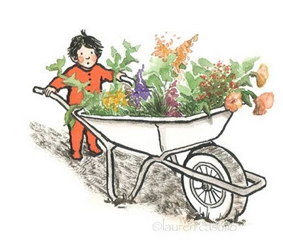
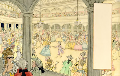
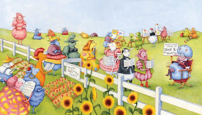
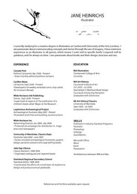
Portfolio Presentation:
Research each client, and include 2-3 pieces that reflect their direct needs. For example, if you're submitting to a gardening magazine, have a few pieces featuring plants or gardens. If a client uses a wider variety of subject matter (like a newspaper), include more variety in your portfolio.

If you're focused on one genre, such as children's books, demonstrate your variety within that field. Include different subjects, different media and black and white work.

Don't put any life drawing or sketchbooks in. It is understood that you can demonstrate classical skill, the editors would rather see relevant application of that skill.

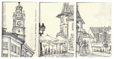
For an editorial portfolio (newspapers and magazines) you might want to include: people/portraits, typography, buildings and landscapes, common objects, pattern, characters, jokes, and food. Don't make the illustrations too intricate because you want to make sure you can produce them within one or two days. The lead times for newspapers could even be as quick as a few hours.

You want your portfolio to be able to say: 
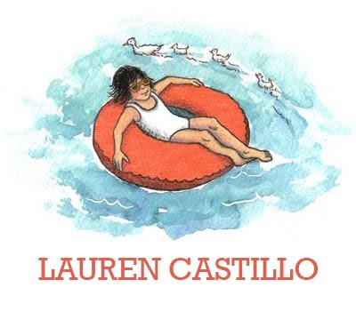
This is who I am, this is my style, this is how you can use me.

The Economic State of the Industry:
Benjamin Cox, of CIA (Central Illustration Agency), re-assured the audience that he has noticed absolutely no slowdown in commissions in the last year. On the contrary, customers seem to prefer hand-made illustrations (watercolour, collage, etc) over flashy graphic design as it gives a more re-assuring message to consumers.

And....Finally. If you demonstrate professionalism and respect for your own work, clients will treat you with the same respect.

Make sure you check out the Association of Illustrators website for up-to-date information about the industry, agents, pricing and news.

Medieval Ivories and Works of Art in the Thomas Collection

I received my copy of "Medieval Ivories and Works of Art in the Thomas Collection" this week. It is co-written by my wonderful Courtauld tutor, John Lowden. He commissioned me to do an illustration representing the anatomy of an elephant tusk and skull and how ivory sculptures were harvested from the tusks. In his opinion, it was to be 'the definitive representation of how ivories were carved from tusks.'

This illustration sums up why I love my craft. Though I had helped John Lowden research some of these ivories whilst studying with him, I realized that I had no practical knowledge of how the anatomical structure of a tusk worked. I called the Grant Museum of Zoology and asked for their advice. They humored me and my ignorant queries generously and sent a diagram of the Elephantidae skeletal system.

As an illustrator, one never knows what one is going to learn next!

It was a difficult and involved commission, but it turned out wonderfully. The book is beautiful. It is full of colour photographs of the statues and objects, and even has several pull-out sections of ivory diptychs. Stunning. I am so happy to have been a part of the project.

These ivories resided in the Courtauld Institute in London for many years, but they were actually owned by the Canadian collector Ken Thomson. He decided that they should be relocated to and exhibited in the Art Gallery of Ontario. Thus the book was born. The irony is that they should find a Canadian illustrator to illustrate Canadian ivories which were both residing in Britain at the time. Talk about synchronicity!

Designing a creative CV

Writing a successful CV for the creative industries is different from most other industries. A well-designed CV is the first impression a future employer will get of you, your style, and your methods of working. It is your first opportunity to market yourself.

This blog post is not about the content of your CV, as there are a plethora of internet articles about what to include (personal details, education, work experience, hobbies, references, power words, etc). Rather, this article is about creative design and how to tailor your CV to your own particular style.

Branding is one of the strongest propaganda and marketing tools available. A well branded CV is the first taste of your style an employer will receive, and you need to convince him or her that seeing the rest of your portfolio would be worthwhile. A branded CV creates an image of value.

How to design your CV

There is no universal blueprint for how to design your CV, as it must be very personal to your industry, your skills and your goals. However, a successful CV will always have the following qualities:

  • has visual impact to attract employers attention
  • reflects your personality and strengths
  • fits the industry, organization, and job requirements your are targeting
  • demonstrates that you have the required skills

Employers in different industries will be looking for different types of presentation and content. You may need to change the content of your CV for every job you apply to, as it is important to design your CV with a specific employer in mind.

Layout and Design

The layout of your CV is as important as the contents in the creative world. If it doesn't grab your potential employers attention immediately, it may not be read at all. You are telling a visual story of why an employer should hire you and giving them a first glimpse of your portfolio. Pull out the stops and use all your talents!

Type:

You should use layout and typography to make sure the contents are easy to follow and lead the reader's eyes directly to the most important points. To do this you can play with size of type, colour of type and spacing. Be consistent with your font styling. If certain headings or skills are emphasized in bold, for example, the reader will expect all important things to be consistently highlighted.

Images:

You may want to highlight your creativity and innovation by including images in the design of your CV. If you integrate them well, they will make your CV stand out and instantly show the employer your skill and abilities. If you do this, you need to ensure the visuals compliment the overall look of the CV.

Length:

Your CV shouldn't be more than two pages. If it is, make sure it is only one page double-sided and that you put the most important information on the first page. Place the various sections in an order that will highlight your strengths.

Make sure it photocopies well, and is easy to email.

Examples of creative CVs

To see examples of award winning CV design, click

here.

How to do a radio interview for artists

This morning I had my first radio interview at CHSM1250 and MIX96.7 in Steinbach to promote my book signing and reading of Magic at the Museum tomorrow evening at the Jake Epp Library. These stations cover most of South-Eastern Manitoba and it was the morning show, which meant that hundreds of commuters would be listening is as they drove to work. I was incredibly nervous, but it ended up being more fun than I anticipated (and now I can't wait to do it again!).

A radio interview is like a conversation, but with legions of invisible people listening in. This is simultaneously comforting and unnerving; while you are recording it feels like there are only two people present, but rationally you know that there are many more silent participants in the exchange.

Interviews are excellent way of communicating your message or information about your products to the media. Marketing essentially means making people aware that a product exists and communicating its value and uniqueness to customers. The problem with promoting art over the radio is (obviously) that radio is an aural experience while art is visual. The best way to overcome this limitation is to paint word pictures to describe your work and use illustrative examples in your conversation. You want people to be able to visualize what you are talking about as they drive to work.

The interviewers Michelle Sawatzky and Corny Rempel made me feel immediately comfortable, so my nerves passed very quickly. However, no matter how comfortable you feel, it is still good to have a few guidelines to follow:

1. Have your talking points in front of you, concentrate on getting them across.

2. If it is live, find out how long it will be and how many commercial breaks or songs there are. Commercial breaks are great for planning the topics of the next segment with the interviewer.

3. Find out what kind of audience the show attracts, and pitch yourself appropriately.

4. Avoid talking fast (or too slow), and avoid saying too many ‘aahs’, ‘umms’ and ‘like, you-knows’. Avoid jargon. Annunciate, annunciate, annunciate.

5. Keep your voice even, warm and animated, you want the listeners to like you.

6. Radio stations are always on the lookout for good sound-bytes. See if you can record a promotional for the station saying something like, “Hi, I’m author Jane Heinrichs. Thanks for supporting the arts and listening to MIX96.7.” That way your name will frequently be heard, and you are also advertising the station. It is a win-win situation.

7. Always say thank-you to your host on air, and use his or her name.

8. Keep answers brief, but interesting. You don’t want your host going overtime.

9. Good interviews take practice, the best way to improve is through experience.

10. Send the producer or host a thank-you note afterwards.

Next time I would like to do a phone-in competition or giveaway to up viewer participation. Perhaps my next opportunity will be next summer when we do an official book launch at McNally Robinson Grant Park as well as several school visits and events.

Download the Podcast

HERE

Roman Pottery Profiles (North Africa)

I mailed a disc of 250 (ish) jpegs to Toronto today. Each illustration is a profile of a roman pot from Leptis Minus in North Africa. Here you see two of the more complete amphorae. The other 248 were varying sizes from complete pieces to itty-bitty sherds.

I had a misunderstanding with one of our tutors yesterday at college. She told me that my drawings were too exacting, too accurate; they needed to be looser and more scribbly. I understand her opinion, but when I told her my background (and the need for swift accuracy) she looked nonplussed. I cannot help that the instinct for accuracy leaks in to my creative work.

These pottery illustrations should be published in 2009 in a monograph covering all aspects of Leptis Minus. I have been working for a long time on illustrations for this book: building reconstructions, statuary, small finds, and pottery (...of course, pottery).

When I went to Lamta (modern-day Leptis Minus) this summer one of the dig directors said to me, "I've been warned about you. They told me you don't like drawing pottery profiles." I laughed. She added quietly, "I can't blame you." Handling pottery sherds certainly isn't my favourite: they have an odd, sand-papery texture; they are dusty; they break my fingernails; and they are little abstract pieces of broken pots. All I usually have to work with is a minuscule rim sherd, from which I have to reconstruct as complete a profile as possible.

Drawing the profile is a non-intuitive process. First you visualize a cross section of the rim in your hand and draw it. Then you measure the curvature of the rim to determine the diameter of the pot. Once you have the measurements, you reflect the cross section on to the opposite side and draw the outer markings. Some people work with a curve comb or plasticine to form a mold of the pot to trace. I find it much easier to quickly measure with my eye, and then draw as accurately as I can on the first try. Once you've drawn several hundred pots you develop an instinct for the rim shapes. The profile pictured above was just a rim, nothing else was left of the pot.

I don't underestimate the significance of these illustrations, as the specifics of roman pottery (where and how they were made, and in what style) can tell a lot about the culture and economics of a region.

If I have to draw pot profiles, I much prefer ARS (african red slip, to those of you who are sniggering). They have a silky smooth texture (no rough hands and broken nails) and they are often decorated with appliqué or incised patterns. Very beautiful.

I'll post an ARS or two for comparison in a day or two.