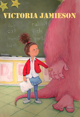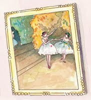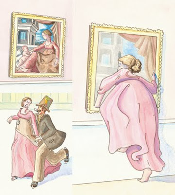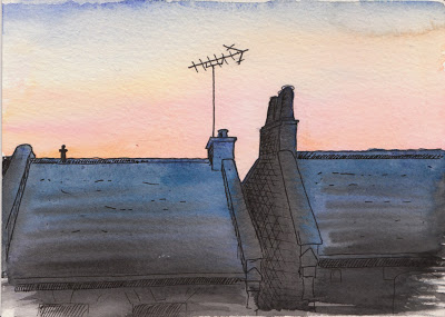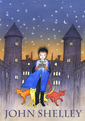
Image © John Shelley
I first met John Shelley in Bologna (2010) when he was manning the SCBWI stand. I popped by to have a chat about joining the society, and we found out that we share the same post code in London (and the same local coffee shop). He has worked as in illustrator in Japan for 20 years and has recently relocated to London.
I admire the delicate perfection of his illustrations, which perfectly evoke the golden age of children's book illustration. Read on and find out more about him in the interview...
1. What’s on your nightstand right now?
A lamp, an alarm clock, a copy of Margaret Wise Brown: Awakened by the Moon by Leonard Marcus.
2. What was your first illustrating job?
First professional commission was to illustrate the book Fat bag by Jeremy Strong, published by A & C Black, a few months after graduating. I drew a coloured jacket and around 30-40 interior black and white drawings. The Puffin paperback edition (with different cover) is still in print, a little to my embarassment!
3. How long have you been an illustrator?
29 years.
4. Which success, either personal or professional, are you most proud of?
Professionally I’m quite proud that I carved a successful illustration career for myself in Japan after arriving with just a suitcase, a portfolio and a phrase book, and became established there for over 20 years.
On a personal level I’m just grateful that I’m surviving, and still smiling.
5. Do you have any comfort routines to cope with rejections?
I think it’s essential to develop a thick skin against rejection. I try to expect nothing but hope for the best, so am always very pleasantly surprised when things do go right. When things take a downturn go for a long walk, refresh your mind doing something utterly different, then hang out in a bookshop or gallery, get inspired, breathe deeply and carry on. Once more unto the breach!
6. Which illustrators or artists do you admire the most? Why?
I admire many, “favourites” are always changing, and if asked to name names find it almost impossible to make a short list, especially in this internet-age. Often nowadays I jump on images rather than artists - such and such a picture or book rather than the artist’s entire output. If you ask me who has been most influential on me (subtly different to favourite) I’d say the Golden Age illustrators (Rackham, Dulac, Heath-Robinson etc), Rowlandson, Herge, Quentin Blake, Edward Ardizzone, Japanese Ukiyo-e artists, Indian/Persian miniatures etc. These indicate where I’ve come from, though it doesn’t mean I’m not equally inspired by newer artists or fresh things around me. They indicate where I started from creatively, but not necessarily where I’m at now, or where I’m going.
7. What was your favourite book as a child? Does that book influence you now?
I didn’t have many books as a child, I remember being fond of Beatrix Potter and Rupert though. One definite favourite was one of my mother’s books from her 1930’s childhood which was usually shut away out of reach, a volume of collected fairytales including illustrations by the Robinsons, Rackham etc.
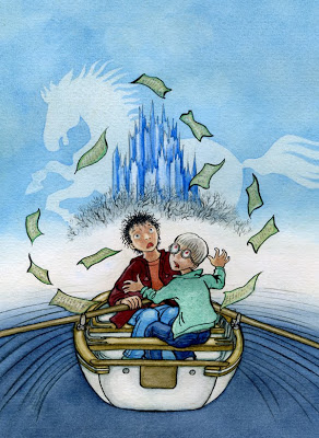
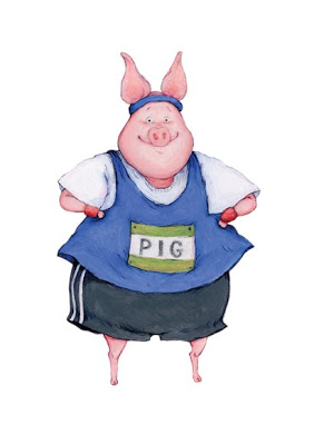
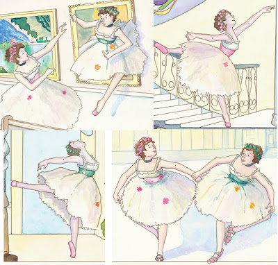
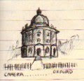
Image © John Shelley
8. What are the essential items to take with you when you go out? (sketchbook, journal, camera?)
I always carry a small pocket sketchbook, a notebook for story ideas and a pen. I feel naked without a sketchbook.
9. What is your favourite medium for illustration? When did you first start using it?
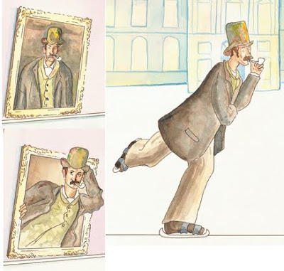
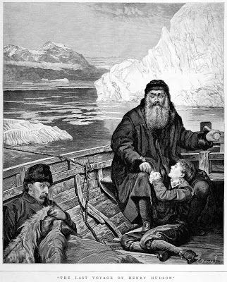
Pen & Ink (with or without watercolour). I used to draw incessantly with ball point pens from at least the age of 12. When I was around 14 a school art teacher saw some of these drawings and recommended I try pen & ink. The first thing I attempted with a dip-pen was to copy a Victorian engraving of The Last Voyage of Henry Hudson (after the painting by John Collier). A tough challenge! But I never looked back thereafter.
Here’s the original, no idea what happened to my adolescent version:
10. How good is your handwriting? Do you use your own handwriting in your illustrations?
Well I’m legible I believe! I occasionally use my handwriting in children’s illustrations when the situation allows. I’m often asked to create chunky hand-drawn lettering in commercial illustration in Japan.
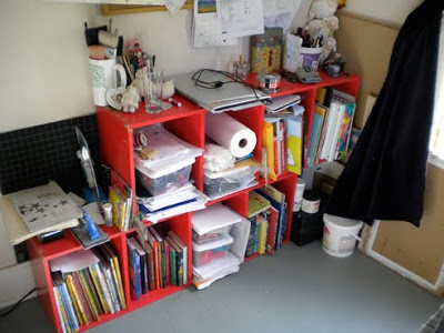
11. What do you collect? Why?
I used to collect many things, but have considerably trimmed down since leaving Japan, I jettisoned a vast amount of things when I left, some of which I later regretted, like my entire record collection (sob).
The few things I’ve held onto are very dear to me. I’ve a good collection of 1st Edition Golden Age (1890’s-1920’s) books, mostly Arthur Rackham with a few others, though I haven’t added titles for a few years. I love them not only because of the artwork, it’s the books themselves, the feeling of pressed type on the page, the tipped-in plates, the care of production, the layout.
12. Do you have a ‘style’ or do you vary your methods for each project?
It’s important to limit your range of styles and not be too scattered in interpretation, though I tend to be quite broad. I adjust style somewhat to match the text of books or the project, but I try to keep an overall continuity within my work. I try to develop my interpretation of the text based on the mood created by the work. Mervyn Peake once said “books have different smells... It is for the illustrator to make his drawings have the same smell as the book he is illustrating” . I find that a good policy, as long as you don’t lose track of your overall creative vision. Adhere to your style, but remember that “(the illustrator) must have the chameleon's power to take on the colour of the leaf he dwells on”.
13. Do you scribble in the margins of books?
Absolutely not! books are sacred.
14. Do you have a morning routine in the studio to prime your inspiration?
No, I should though.
15. When do you work best, in the morning, afternoon or evening?
I used to be a total night-owl, nowadays I tend to get into my stride late afternoon, unfortunate as I have to down tools and look after daughter then. I can be very focused first thing in the morning if I’m not distracted, but life being what it is....
16. What is the one art supply you could not live without?
Black ink.
17. Do you have a favourite café or restaurant in London?
I’m looking around, I like the new café in Queen’s Park though.
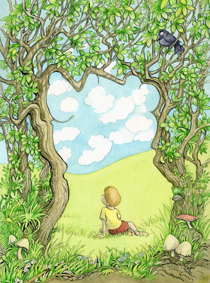
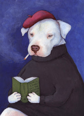
Image © John Shelley
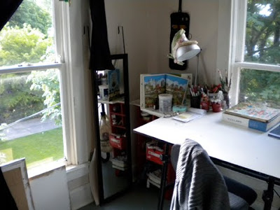
18. When you look out the window in your studio, what do you see?
My home is studio at the moment and I work in two rooms. Front room overlooks grassy Queen’s Park. My workroom (where I actually paint) is not quite so inspiring - yard and fence dividing next door’s garden.
19. How do you like your coffee, or tea?
Coffee - strongish, always filter, never instant.
Tea - milk, no sugar.
20. Any words of advice for other illustrators in the field?
Keep drawing, keep sketching, exploring ideas. Keep pushing and explore ways to reinvent what you do. Follow avenues of inspiration. Stand back, look at the market and see how your work fits in, make your work is sellable, but don’t sell out.
Don’t be put off by moaning minnies about the economy poor market for illustration, if you’re good and have a vision, the market will be there.
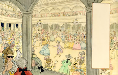
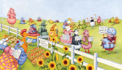
Image © John Shelley
For more information about John Shelley you can visit these links:
Website:
http://www.shelleyillustration.com/
Blog:
http://johnshelley.blogspot.com/
Flickr: