Magic at the Museum: The Madonna

The next character from Magic at the Museum that I want to introduce you to is the Madonna. She comes from a painting of the Virgin and Child by Parmigianino, painted between 1524 and 1527. He painted it when he was staying in Rome, and the classical building in the background might be a references to the ruins of ancient Rome.

This painting is unfinished,and is quite sketchy, especially in the bottom right corner, where you can see his sepia sketches. The brown sections of the Madonna's skirt are unfinished; Parmiginanino intended them to be blue. I left them brown on my character to stay true to the painting as it is, not as it was intended.

He wanted this painting to be perfect. This perfectionism led him to procrastinate to such a degree that he never finished the painting and was imprisoned for breach of contract.

The Madonna in this painting has incredibly long legs, arms and neck. If she were real, she would probably be over 6 feet tall (rather like the exaggerated proportions of Alexandre who was painted 3 centuries later). This is due to the Renaissance Mannerist  movement. Mannerist paintings are known for elongated forms, precariously balanced poses, a collapsed perspective, irrational settings, and theatrical lighting. It was a challenge to maintain those distortions when drawing the Madonna, for I always wanted to "correct" them!

The Madonna and Alexandre make a pair. They both have exaggerated proportions that make them unnaturally tall.

How to put together an amazing illustration portfolio

As an illustrator, you portfolio is the most important thing in your arsenal of tools. It showcases your talents to the world and gives potential clients an insight into your working style. Your portfolio must show your pride in your work. It must present your work as luxurious and beautiful, something for art directors to covet. Show your artwork the respect it deserves and other people will be impressed as well.

1. Buy a beautiful portfolio case or binder. My personal favourites are Pratt and Panodia. They are smart, professional, and durable. Your portfolio will land in a pile of other portfolios on an art director's desk, you want it to have presence and weight. To stand out from the others because it is beautifully and professionally presented.

2. Personalize the cover in some way. Many of my friends glued on cards with their name and address. I didn't feel comfortable denaturing the front of my beautiful portfolio. Instead I took a piece of ribbon and tied my business card to the front loop. This way it makes the portfolio look like a gift for the art director.

3. Sleeves: Make sure your plastic sleeves are as transparent and fingerprint free as possible. You want to your artwork to shine.

4. Paper: Don't tape or glue photocopies of your artwork onto the grey or black backing pages of the portfolio. Print your images onto sumptuous heavy rag paper, such as Somerset Velvet, which is lightly textured paper for inkjet printers. The art paper makes the digital print look almost as good as the original, the colours sit on top of the sizing of the paper, rather than soaking in like regular paper. This makes them extra brilliant.

5. Title Page: The title page is the first thing an art director will see. Make sure you have a strong image on that page, as well as your contact details. This will make them curious to find out what is in the rest of the book.

6. Page and Book Design: Make sure your spreads are well designed. Think about the portfolio as a book, not just a collection of images. Start with your strongest images at the front, then include with a few projects you are proud of, then then end with a few strong images again. You have to think of the structure like a sonnet or an essay with an introduction, a body and a conclusion.

7. Number of Images: Most mail-in submissions ask for 8-10 images. However, you can indulge when you get the chance to show your physical portfolio. I suggest having 20-40 images. This is your chance to shine; show your diversity.

8. Can I have more than one image on one page? Yes. But make sure they are paired well so the compliment rather than compete with each other. Make sure you keep a good rhythm: some pages with only one image, some pages with more. This keeps your book interesting.

9. Include some postcards: I always submit my portfolio with a few postcards that the art directors can keep. This helps me to gauge their reaction. If they keep the postcards I know that they were interested.

Magic at the Museum: Alexandre

Continuing with my series of characters from Magic at the Museum, I want to introduce you to Alexandre. "Man with a pipe" was painted by Paul Cézanne, and now hangs in the Courtauld Art Gallery. Alexandre was a peasant gardener. I think Cézanne used lots of browns, ochres, yellows and greens to paint him because he worked with in nature and with the earth.

Cézanne focused on the relationships of colour and tone, rather than literal representation of the subject. I tried to emulate that by laying the water colour pigment quite thickly on the paper.

If you look closely, you will see that his head is very small compared to his body (or, perhaps he is just very tall). I used this feature to advantage in the action scenes; Alexandre always looks very strong and powerful. In response to the sometimes odd perspective in his paintings, Cézanne told his critics, "I have a lazy eye." :-) Alexandre's elongated body perfectly compliments the strange anatomy of the Italian Madonna, whom you will hear about next.

The skating pose you see above is a funny quote of a Scottish painting called The Reverend Robert Walker Skating on Duddingston Loch. It was painted by Sir Henry Raeburn in 1790. I think it is really fun to add small art historical inside jokes into children's picture books. Although the children and parents might not understand when they read the book, it will add an element of depth that otherwise wouldn't be there.

Creating and Designing a Family Cookbook and Genealogy


Often the things we remember most about our families is the food we eat when we are together. Every family has treasured recipes that are beloved as much for the memories they evoke as how they taste. Those recipes tell a sensual history of a family: of generations passing down good food, good experiences, joy, sympathy, love. Many emotions can be intimately tied to food and its preparation.

Turning those family favourites and heirloom recipes into a cookbook is an original and inspired way of telling your family's history. The story slides imperceptibly from family recipes, memories, and photographs to family history and genealogy. It is a more human way of connecting one's life to one's history. Sometimes looking at family tree charts and time-lines can seem quite abstract and clinical. Combining them with recipes and stories makes the history more immediate and accessible.

Steps to Create A Cookbook:

1. Collect the Recipes: Send an email or make a phone call to your relatives asking for their favourite recipes. Set a deadline for the submissions so people don't forget. Organize them into sections: breads, appetizers, main dishes, side dishes, desserts, etc. Don't forget to include the name of the person who submitted the recipe.

2. Test a few of the recipes: Old recipes that have been passed down through the generations are often taught by example. The actual written part of the recipe functions as short-hand notes. Baking temperatures or times are often not included. It might be best to test these so that modern cooks won't find them so difficult.

3. Collect Memories: Ask for people to submit memories of your grandma's or great grandma's kitchen. Memories of when the food was served, or what particular dishes meant to people. Share traditions surrounding the preparation of a dish. Don't forget those memories when the food was burned but the evening was glorious. Or tender moments shared over a cup of tea and a cookie.

4. Collect photographs: Ask for photographs of your family preparing or eating that food. Don't forget photos of the prize winning vegetables grown in grandma's garden, or the apron that everyone begged to wear. Scan handwritten copies of recipes that are special. If certain family members don't cook, this is their area to shine. They can submit memories of eating their favourite foods. Make sure everyone is included.

5. Design your cookbook: The easiest way to design a book is to use a special book design program like InDesign or Publisher. However, you can do it in Word or any text editing software if you can't access these more specialist programs. Make sure you use fonts that are easy to read (like Times New Roman, Ariel, Lucida...). Include photos and memories on the recipe pages where appropriate. Design a title page for each section.

6. Family History: Make sure you include a written history of your family as far back as you can go. Also include family tree charts, photos of old homesteads, photos of relatives, and anything else you think might be relevant or interesting.

7. Introduction: Don't forget to write an introduction explaining why you decided to compile the cookbook and why you think it is special.

8. Indexes: Create an index of recipe titles. It is also useful to create an idex of contributers, so that people can easily find their recipes or memories in the book.

9. Publishing your book: You can print it at home and bind it with staples or in ring binders. Or, you can bring the file to a copy shop and have them print and bind it professionally.

Some Highlights of Our Cookbook:
  • It is over 200 pages long
  • Our family recipe for gingersnaps goes back at least 4 generations!
  • It took us just one month to design (but over a year to collect all the recipes)
  • We included Low German (plautdietsch) songs and rhymes that we used to sing as children
  • I did a watercolour illustration of a favourite recipe for each title page
  • Each watercolour features yellow gingham, because our grandmother had a beautiful yellow gingham apron.
I have uploaded an abridged version (not all 224 pages) to Issuu, where you can page through the book for inspiration. Enjoy! To see the cookbook in a larger screen, just click on it.

Note: In order to be able to see it you will have to visit my blog, for some reason Issuu doesn't work in feed readers or facebook.

Magic at the Museum: Elizabeth Bruegel

I am working on a new picture book, and developing the characters and their personalities is making me nostalgic for my characters in "Magic at the Museum". People think that picture books are simple: after all, they're only 32 pages and for children, right? But that is not the case. So much thought goes into developing each character and each scene. I thought I would share the backstories of a few of my favourite characters.

Elisabeth Bruegel

Elisabeth was born in 1609, the second child of Jan Bruegel the elder and his wife Catharina. Jan Bruegel was a well known painter from Antwerp, the Netherlands. The painting in the Courtauld Insitute of Art which inspired me to include her in "Magic" was their family portrait painted by Peter Paul Rubens. Elisabeth was between 4 and 6 years old when this portrait was painted. She gazes lovingly at her mother.

17th century fashion for children

Elisabeth wear fashionable clothing (contrasted with her parents restrained, but rich, style) and she has an expensive coral necklace. With the advent of trading in Asia (and the foundation of the Dutch East India Company), coral became a highly sought after item. Coral was believed to protect children against evil.

Ribbons of Childhood - Leadstrings

The ribbons the hang from Elisabeth's shoulders were sewn there not just for decorative purposes. They helped her mother (or her nannies) to grab hold of her if she was running away, rather like a modern day leash for children. They were very fun to illustrate, as I imagined that they would fly in every direction when Elisabeth skated or ran.

So there you go, the things no one ever told you about Elisabeth Breugel.

View from my studio window

This is the view from my studio window. I live on a road of Victorian houses that have been converted into flats. My studio is on the top floor, facing the road, and I have a beautiful view of rooftops, chimneys and TV aerials.

What do you look at while you are in your studio? Is your view inspiring or boring? If you want to share, post your pictures online and share a link to them in the comments section. I love to take virtual tours of the world, one artist's studio at a time.


Van Gogh at the Royal Academy

I am seeking

I am strong

I am in it with all my heart

--Vincent van Gogh

One can really feel that passionate soul at the current van Gogh exhibition at the Royal Academy in London. It is called "The Real Van Gogh: The artist and his letters" and traces his development as an artist through displays of his letters to his brother Theo, sketches, and finished paintings.

It struck me that the letters, with their sketches in the margins, were rather like modern day blog posts. Van Gogh was trying to share his studio work with his brother, but couldn't take photographs (or send emails) so he posted his musings and sketches in the mail.

Every artist feels very alone in the studio (I know I sometimes do). Sharing things online and receiving comments and encouraging words helps to fill the void.

If you have a chance, take a trip to the Royal Academy. You will leave absolutely inspired. If you don't live anywhere near London, go to your local library and pick up a book about Van Gogh. The best is to get a compilation of his letters (this is often available via inter library loan). Or, better yet, go to this WEBSITE which has all 902 letters online! For each letter that includes a sketch you can click on a little link called "sketch" and it will show you a zoomable image of the letter. They are so fascinating, and well worth browsing for a little inspiration.

Watercolor Wedding Portrait in York Minster

Last week Mom and I went to York to see the pre-Christmas decorations, drink mulled wine and tour York Minster, which is the largest Gothic cathedral in northern Europe. It also has the greatest concentration of preserved medieval stained glass in any cathedral in Britain. While Mom and I were gawking at the beauty surrounding us, we noticed a bride walk into the transept on the arm of her father. An organ voluntary played, and they processed down the aisle. A wedding was about to start in York Minster.

Seeing the bride, overwhelmed with happiness and emotion, in such a grand setting inspired me to paint a picture of the moment. There is no way I could ever capture the intricate detail of the minster architecture in a small watercolor (it is 5 inches by 7 inches), so I left that out and focused on creating the feeling of space by leaving the page blank. Here you see the bride and her father processing behind a minster official.


Here are a few photos from our weekend in York....

The Shambles is one of Britain's best preserved medieval streets

York Castle

Art and Nature

I just received my copy of Art and Nature: Studies in Medieval Art and Architecture, published by the Courtauld Institute of Art through their "Immediations" imprint. It was edited by my good friend Laura Cleaver, and I was commissioned to do three illustrations of medieval architecture and architectural elements.

This cathedral plan is from Nicosia Cathedral on Cyprus.

These reconstructions of wall-paintings and architectural elements are from Ourscamp Abbey and Noyon Cathedral in France.

I had great fun working on the projects with Michalis Olympios and Géraldine Victoir.

Dealing with Migraine Pain

I suffer from occasional debilitating migraines and this week was no exception. I was flattened, rather like the Lady Cottington's pressed fairies. I spent days and days in a darkened room until I was given a wonderful new migraine painkiller called Maxalt. It dissolves on the tongue and the piercing pain is eradicated almost immediatly. I popped back into shape, rather like cartoon characters after they've been steamrolled.

Now I'm back to the drawing board and excited to start new projects. I have lots of exciting ideas!

My Visiting Artist Lecture at the University of Manitoba School of Art

Poster courtesy of Kirk Warren

I was invited by the University of Manitoba School of Art to do an evening lecture on illustrating children's picture books. Life came full circle - I studied art history at the school of art, and now I was lecturing there as an 'authority figure' to the students. It felt like a homecoming.

The painting studios at the School of Art are housed in an old barn that was once used to house livestock for the agriculture department. When the agriculture department had outgrown the building, the School of Art re-purposed it for studios. The vaulted space in the roof is amazingly light, airy and inspiring - the perfect place to learn to paint. The student lounge had cool mural painted on the wall. One wall said [SM]ART FARM, which of course makes sense because of the barn.

The room was packed with people. I had expected maybe one or two intrepid artists to show up, and I would have a little "fireside chat" with them around my computer and portfolio. It was not that intimate, in fact, they even had to fetch extra chairs !

Thank-you to everyone who came and asked questions. It was a pleasure!

Magic at the Museum is a bestseller for two weeks in a row

This morning I picked up a coffee in Caribou Coffee, which generously offers free wifi, and read a delightful email notifying me that "Magic at the Museum" has now reached the number 2 spot in Winnipeg for the second week in a row. I hadn't expected to make it back on the list, and it was even more surprising that I maintained my standing from the previous week. Thank-you Winnipeg!

In 2007 I was in despair over whether or not my book would ever be published. A very empathetic friend cut the Winnipeg bestseller list out of the Sunday Free Press and added the working title of my book, "Anne's birthday surprise", to the number one spot. I don't know if I'll be able to reach the top and jockey "Where the Wild Things Are" out of the starting position, but it doesn't really matter. The fact that I've made it to number two after several bitter disappointments proves the power of positive thinking.

And, I just had to take a picture of the wonderful bestseller display in McNally Robinson Grant Park, with "Magic at the Museum" front and centre.

Magic at the Museum is a Winnipeg Bestseller!

After the success of the book launch last night "Magic at the Museum" made it to the #2 spot on the Winnipeg Bestseller list for the week of 6 Sept 2009. It even muscled its way past Sendak's classic "Where the Wild Things Are."

Make sure you buy your copy of the Winnipeg Free Press on Sunday where the list will be published for all to see!

I want to send out a heartfelt thank-you to everyone who bought my book.

Magic at the Museum book launch at McNally Robinson Booksellers

Six years ago I attended the launch of "I gave my Mom a castle", written by Jean Little and illustrated by Kady MacDonald Denton. I sat in the Prairie Ink restaurant at the McNally Robinson Grant Park and resolved that I would some day do the very same thing: host a book launch at my favourite bookstore in the world.

Six years of hard work, inspiration, desperation and tears resulted in fulfilling my dream.

Last night I hosted a magical book launch for "Magic at the Museum" at McNally Robinson. It was very well attended (better than I expected) and everyone was delightfully enthusiastic and encouraging. I read from my book, and then displayed a few original sketches and illustrated spreads from the book.

The reception I received confirmed for me that I am definitely following the right path. The path to publishing success can be fraught with difficulty, disappointment, and despair. Sometimes a light shines through the clouds and it's in those moments you know that it's worth all the stress and hard work

.

Reading at the Mennonite Heritage Village

Yesterday I did a reading of "Magic at the Museum" at the Fall on the Farm festival at the Mennonite Heritage Village in Steinbach, Manitoba (Canada). It is the best museum in my home town. :-) I read my book to the admiring audience, and then answered some questions about how I did the watercolours and wrote the story.

It was great fun to be at such a huge community event and meet lots of people from my childhood. I even got a short visit from Mr. Martens, my grade 8 home room teacher. He hasn't changed a bit!

I did a little pen and ink sketch of the wonderful windmill. The town has largely dutch-german heritage, and we built wonderful windmills to grind the prairie wheat into flour for the best bread in the world. I'll post a scan of the sketch shortly, but for the moment, to keep your curiosity sated, I will post a photograph...

Our Stall in Spitalfields Market

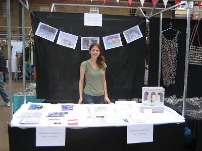
Yesterday I organized a market stall in Spitalfield's Market, near Liverpool Street Station. A market has been operating in that area since 1638, when King Charles I granted a license for vegetables and meat to be sold in that area. In the 20th century the area became a haven for artists, and many now-famous artists and designers began their retail careers in the market.

This is what we at "Playroom Collective" hoped to achieve by organizing a market stall in the prestigious market. But, however glamorous it might seem to have a stall in Spitalfields, it certainly very hard work, for very small returns.

It seems that the economic downturn has hit craft and antique markets. In the past a recession usually boosted the trade of markets such as Spitalfields because consumers were opting to buy locally (and usually cheaper), rather than spending their money in the high street stores.

However, the most recent recession has hit particularly hard, and this might be due to a change in how people buy products. Now, many people would rather look for their bargains online, either buy searching ebay, amazon, and other large e-retailers, in addition to looking on publicly run sites like gumtree and craigslist.

I talked to many of the vendors at the market yesterday, and most expressed concerned opinions about how hard it is to break even on any given day of trading. The price for a stall on Friday is a mere £15; as a group we Camberwell artists sold only £13 worth of goods (that's RRP, not cost price, so no profit was made...). We did not break even, as a group, but it was a valuable exercise in retail management, so definitely worth the expense.

The vendors mentioned that trade usually picked up from September to Christmas.

The people I spoke to said that their presence in the market was a publicity and "marketing" effort. When customers saw them consistently (every friday, for example), they would be more likely to call or email them on other days to place orders or ask questions. If you are prepared to occasionally make a loss, then having a stall at Spitalfields might be the right thing to boost your business into the public eye.

Cloth

Another thing to consider is the set-up cost of the stall. I arrived with a white table-cloth, but hadn't realized that one really needed a "modesty" cloth for the front of the table, as well as a backdrop. I was lucky, and my neighbour lent me some black cloth to dress the stall.

Signage and Branding

I printed several signs on A4 paper that advertised "Playroom Collective." These were sufficient for the first attempt at a stall, but in the future one would want a larger and more catchy banner or sign. You need something that will tempt punters to browse your goods.

Chairs

Marketer beware: Spitalfields does not provide chairs for the vendors. I spent the entirety of the day sitting on an upturned carry-on case, which was (needless to say) rather uncomfortable and frequently precarious.

For a full list of other things to consider when operating a market stall click

HERE.

Don't worry. Everything is going to be amazing.

It was one of those days when I woke up and wished I could go straight back to bed. Working as a freelance illustrator means that my days are largely self-motivated. If I don't get something done, I'm the only person I have to answer to (aside from the occasional deadline). And... speaking of deadlines, I love them, because then it means that I'm needed! But this also means that I am often too hard to myself. I probably speak more harshly to myself, and more critically, than any manager, editor or boss would. Sometimes I need to remind myself to enjoy the moment, and remember that I'm doing what I love.

So, I went for a walk in the (almost) rain to clear my head and attempt some ambulatory encouragement. Low and behold, the universe sent me the sign I needed. At the corner of Westbourne Grove and Chepstow Villas in Notting Hill I saw a shop window whose sign read, "Don't worry. Everything is going to be amazing."

I suppose I have to take the universe at its word, and believe that it is true. Wasn't it Deepak Chopra who said, "...pay attention: nothing is random, your life is full of signs and symbols."

I haven't posted much artwork lately, mostly because my current illustrations are of the boring variety (more Roman pottery, anyone?). However, I have been turning a little bit of spare time to working on one of my book dummy ideas. I had shelved the sketches for "One, Two, Buckle my Shoe" several months ago because I couldn't see where they should go. But, now I have a little more clarity.

And remember. DON'T WORRY: Everything is going to be amazing!

Drawing like Picasso

On Friday I went to the Picasso exhibition at the National Gallery in London. The premise of the exhibition was looking at how Picasso used his knowledge of art history and old master paintings as subject matter for his cubist style. Being an art historian myself, I enjoyed following the clues and finding stylistic and thematic links between the Picassos and the 'old masters.'

And, being an art student, I also enjoyed standing around in the crowds of people admiring the paintings (making a nuisance of myself, I'm sure) in the vain attempt to understand cubist style. I can see the logic behind Picasso's finished drawings, but it entirely escapes me how he arrived at that point. What is the internal logic of cubist drawing? It must be: draw every angle and every plane of the object at once, as if they were all facing forwards.

The top two sketches are from Picasso paintings. Then, I became emboldened, and I tried to sketch a woman in the gallery in Picasso style. I'm not sure I succeeded. I think she still looks too 'normal'.

What do you think? Do you have any tricks to draw "cubically"?